from Blogger http://scottmcateerblog.blogspot.com/2017/02/why-you-need-to-measure-brand-equity.html
Analysis Paralysis: Using Google Analytics Data as Inspiration to Act Now
The best thing about Google Analytics is also the worst thing: there’s a massive amount of available data.
Why is that both good and bad?
You can use that data to improve and understand. Your traffic. Your audience behavior. Your goals. Your marketing. That’s good.
But because there’s just so much of it, it’s easy to get bogged down in just looking at it, swimming through it, and not actually making any decisions or doing anything beneficial. That’s bad.
And that’s analysis paralysis.
We’ve all been there: you’re so busy analyzing the data and considering all options that you never actually make a choice. Nothing happens. You’re afraid to make the wrong decision, or you’re overwhelmed with the sheer volume of the data itself and/or the directions you could take it.
In order to succeed, you have to break that cycle. And when it comes to Google Analytics, the only way to sidestep the analysis paralysis trap is to approach it with a concrete reason or plan.
You have to know what you’re doing before you dive into the deep end of the data pool.
Do that, and it can inspire you to action. Today. Right now, in fact. You just have to be proactive in your approach, and go in seeking answers to your already-established questions.
Google Analytics is a very good tool in your arsenal. Good…but not perfect. It does have its shortcomings. But that shouldn’t stop you from turning to it again and again.
Need some inspiration on how to be inspired by the data you’re collecting? I’m here to help. Break the analysis paralysis cycle with these five ideas.
Content Inspiration
If you’re doing any content marketing – and of course you are, because as you may have heard, content is king – then you need a steady stream of content ideas.
And that can be tricky. Coming up with new content is one of greatest challenges about running a successful inbound campaign. According to CMI’s B2C Content Marketing report, when respondents were asked to list their biggest obstacles:
- 56% said producing engaging content
- 46% said producing content consistently
- 39% listed producing a variety of content
What if I told you that Analytics can help with all of that? Know where to look and it can provide more inspiration than a sunset over the Roman Coliseum (or whatever other location does it for you).
I Need Ideas. Inspire Me!
Here’s what to do: head on over to Behavior > Site Content > Landing Pages. This report will give you a list – in descending order from most sessions (i.e. most popular) to fewest – of the landing pages on your site.
Hit the Secondary dimension dropdown menu, and select Source/Medium under Acquisition.
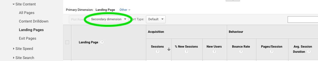
Now you can see the source of the traffic, too.
Pay particular attention to those coming from organic search, referral, and direct, as these are the pages people are searching for and/or clicking the most because it appeals to them or answers their question. These are your popular pages with the public at large.
And instant inspiration for where to turn your content efforts next. Most popular pages all about Topic X? Do more of X. Referral traffic from Facebook always going to posts on Topic Y? Create more Y, and be sure to share it on that platform.
See what I mean? The data here can show you exactly what is resonating with your audience and bringing in traffic.
But don’t just create more of those topics. Think about presenting the opposite view, or updating and expanding, or creating a different content type (video, infographic, blog post, case study) under the umbrella of the popular subjects. Sky’s the limit.
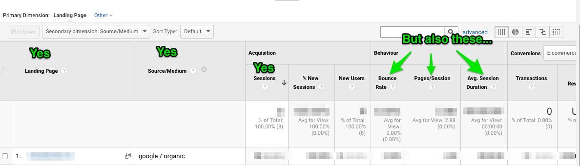
Now, a word of warning: you need to consider the other metrics in the report besides just the number of sessions. Look at the Behavior section (bounce rate, pages/session, and avg. session length). Plenty of sessions, but a very high bounce rate or very low pages and session length means the content is not delivering as advertised. It’s not what your people want. Creating more of that would be a waste of time.
You need to take a holistic view for this to work. Be inspired…but aim for informed inspiration. No one metric can give you the whole picture.
You can do the same thing with Acquisition > Site Content > All Pages to get a general overview of everything on your website. Just ignore your homepage, and contact page, and so forth. Concentrate on the pages that people opt to view the most because it interests them. That’s your content inspiration.
I Need to Populate my Editorial Calendar. Inspire Me!
So now you’ve been inspired. Content ideas are percolating and bouncing around your head. It’s time to start inputting those thoughts into your calendar for the next month, or quarter, or year.
Need a little inspiration as to what to schedule when? Analytics to the rescue once again.
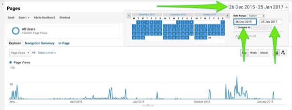
Examine your content over time to see what’s most popular at various points of the year. It’s easy to do. See the date range at the top-right of your reports? By default, it’s set to the previous thirty days, but you can change that range to whatever you want it to be.
Look at a full year. Check out the summer months (June, July, August). Or the winter. The holiday season. Map it out. Plan the coming year in advance based on what was popular at that time last year, or the year before that.
Over time, you’ll likely start to see trends corresponding to set periods of the calendar year. Match your content to its popularity peak for maximum impact.
Inspired? You’ve got ideas, and you know when to schedule them. You should be chomping at the bit to get started.
But we’re not done yet.
Big Picture Inspiration
When it comes to your website, there are basically three things you can do with it:
- Nothing
- Improve it
- Expand it
Surprisingly, “do nothing” is not always a bad thing. If analysis paralysis is keeping you from making a decision and doing something, well then, that’s bad.
But after careful consideration of the data, the best decision just might be to actively do nothing.
I’m Not Sure What to Do with My Traffic Sources. Inspire Me!
Let me give you a quick example using your traffic sources. You’ve got organic search, direct, affiliate, social, email, referral, and paid.
How do you know what you should be doing with each one? Nothing, improve, or expand? The answer is easier than you might believe, and buried within the Analytics data. You just need to do a little digging.
Go to Acquisition > Overview, but change the date range in the top-right to cover at least the past 90 days (or 180, or 365, or whatever). You’re looking for a baseline site average, so you want a larger period of time than just the default past month.
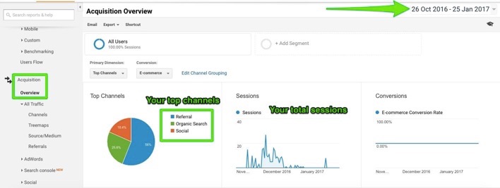
Scroll down to the data separated by channel. For now, we’re only interested in the site average that appears at the top of each metric column.
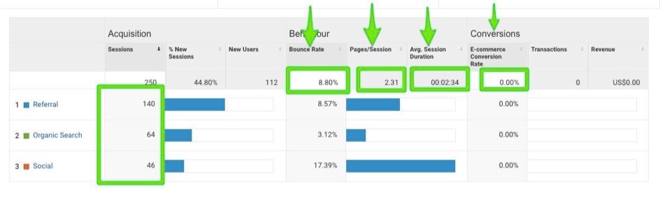
These are your key engagement metrics (bounce rate, pages/session, avg. session length, and conversion rate. Jot them down (you can use a digital notepad, spreadsheet, or even just a scrap of paper).
Next, change the date range to the past seven days or so, and then click on each channel to get their recent individual averages for those same metrics.
You can now compare each channel’s current performance against the site average to determine your course of action. Add up the percent differences (they can be positive or negative) to get a relative engagement score for each channel.
For example, if the site average bounce rate is 8.80%, pages/session is 2.31, and conversion rate is 17.67%, and for referrals the past week we see:
- Bounce rate of 27.53%, which is a difference of -212.84% (remember that for bounce rate, the higher the worse)
- Pages/Session of 3.5, which is a difference of +51.5% (if it had been 1.7, then the difference would have been -26.41%)
- Conversion rate of 42%, which is a difference of +137.69%
We would then add up -212.84 + 51.5 + 137.69 to get a relative engagement score of -23.65%. That’s not great…it’s not even decent.
The closer you are to zero, the more that channel is performing at the site average. A positive engagement score means it’s outperforming, while a negative one means it’s falling short.
To determine what to do, find the engagement score for each channel, and consider it along with the amount of traffic it brings in.
Low traffic and low score? Do nothing (at least for now). It’s not worth the time and energy.
Low traffic and high score? Probably best to do nothing. Engagement is already good, but the traffic makes it a moot point.
High traffic and low score? Improve it. Tweak your content. Boost the visuals, CTA, relevancy, and so on.
High traffic and high score? Expand it. Do more of whatever you’re doing. This audience is keen on you already, and are looking for more of you and your brand.
The Analytics data can give you a quick snapshot of what you need to do for each channel to right the ship, or keep it on course. Nothing, improve, expand.
I’d Love to Increase My Referral Traffic. Inspire Me!
Getting traffic from a link appearing on another website is a pretty sweet deal. Good for you, good for them.
Find the sites sending you top-flight traffic already under Acquisition > All traffic > Referrals. Reach out to them and suggest a guest post idea (complete with a link back to your site in your bio). Click each one to see the exact page your link appears on, giving you more insight into the context and topic of the referral link.
If the traffic is already flowing to you from them, they have a captive audience interested in whatever it is you do and have to say…so give them more. It’s a mutually beneficial relationship.
You can find additional opportunities by finding other sites similar to your top referral sources. A service like the Audience Overlap Tool makes it fast and convenient. Generate a list, then reach out, connect, and engage.
I Don’t Know Which Keywords to Go After for a Quick Boost. Inspire Me!
You know that keyword research is important to your online strategy. And you also know that seeing any kind of result can take a long time. It sometimes feels like you’re not accomplishing anything at all.
Analytics can provide a quick boost using data you’ve already collected on keywords you’re already ranking for. You’re just not ranking well for them…yet.
Check out Acquisition > Search Console > Queries. If you’ve connected your Google Analytics and Search Console accounts, you’ll see a list of search queries that are delivering people to your digital domain, as well as clicks, impressions, CTR, and Average Position for each one.
It’s that last one we want to turn our attention to at the moment. Click the advanced tab and create a filter to include (Acquisition) Average Position Greater than 10. Hit Apply. This will list only those queries where you appeared on page two or higher of the SERPs.

Why are we interested in queries appearing beyond the first page (aka the wasteland of the SERPs)? Because they have low CTRs, but you could easily improve that. Even a small improvement might bump you to the bottom of the first page with only minimal effort. The page(s) already exists. They keywords are already targeted.
Instead, tweak your headline for those pages to include the keyword queries and emotional trigger words (if it can be done naturally). Use anger, fear, disgust, joy, and yes, inspiration to get the click (high arousal emotions – both negative and positive – get more attention). Keep your title tag to under 55 characters.
Next, rewrite your meta description. Limit it to 150 characters. Be clear and concise, making it explicit what comes after they click your link. Write the description like a CTA using power words like discover, learn, uncover, achieve, and so on. And include the search query keyword if possible.
A stronger title and description is often enough to boost your CTR, and a better CTR can give you a quick and easy rank boost. The difference in traffic going from the eleventh spot to the ninth spot (and therefore appearing on page one) is sizeable. If that doesn’t inspire you, I don’t know what will.
That should be enough to keep you busy for awhile. Google Analytics may not seem like much of a muse at first glance, but it’s all in how you look at it. There’s inspiration aplenty. Take action. Slay the analysis paralysis beast. Get better. Grow. And succeed.
In what other ways does Analytics guide and inspire your actions? Leave your ideas in the comments below.
About the Author: Aaron Agius, CEO of worldwide digital agency Louder Online is, according to Forbes, among the world’s leading digital marketers. Working with clients such as Salesforce, Coca-Cola, IBM, Intel, and scores of stellar brands, Aaron is a Growth Marketer – a fusion between search, content, social, and PR. Find him on Twitter, LinkedIn, or on the Louder Online blog.
Analysis Paralysis: Using Google Analytics Data as Inspiration to Act Now posted first on Kissmetrics Blog
from Blogger http://scottmcateerblog.blogspot.com/2017/02/analysis-paralysis-using-google.html
5 Online Marketing Tactics I Learned From My Previous Startup
As a co-founder of an eCommerce startup in a highly competitive industry, I quickly realized that we had to move beyond the basics of marketing optimization and test some advanced techniques to improve our ROI.
After much trial and error, we found few tactics that were really effective. Although our startup did not survive, the learnings I took away from our extensive experimentation and optimization were priceless. In this post, I will cover some of the techniques that worked really well for us.
Before I share these tactics, I would like to point out that it is crucial to achieve a high level of alignment between your marketing, engineering and product teams. Your engineering team should understand marketing and your marketing team should understand the technology. In today’s world, technology plays a significant role in marketing optimization and it is important for your teams to have that common perspective.
Tactic 1: Customize Website Experience Based Upon Visitor Personas
All marketing channels are not equal. Visitors from different channels (or campaigns) are typically in different stages of purchase cycle and have different aspirations. For example, visitors coming from your affiliate channels that focus on coupons are more likely to be interested in exploring discounted products. On the other hand, visitors coming from Display channels such as Facebook might need some inspiration and education before you barrage them with pricing and transactional information. Many marketers spend a good deal of time optimizing the initial landing page to make sure it is relevant to the campaign that brought the visitor. But what about optimizing the rest of the website based upon the visitor’s context?
We found that making subtle changes to the entire website content based upon visitor’s persona (associated with the marketing campaign) resulted in over 20% increase in conversion rate. For example:
- Automatically changing the product sorting algorithm on category pages based upon the type of the campaign that brought the visitors (e.g. automatically showing highly discounted products on top of category pages if the visitors came from “deals & discount” focused campaigns).
- Automatically “injecting” dynamic content through out the website based upon the visitor persona (e.g. Showing “Trendy” and “Lookbook” content to visitors coming from Lifestyle oriented Display FB campaigns).
- Dynamically updating the homepage banner sliders based upon the visitor persona (e.g. if the visitor came from “discount” focused campaign, automatically show the “Sale” focused homepage banner as the main banner).
You don’t need to invest in a highly sophisticated personalization technology to implement these dynamic capabilities. In our case, we used Google Tag Manager to setup above rules to update dynamic content throughout the website. Here are some steps to implement dynamic content for your website visitors using Google Tag Manager:
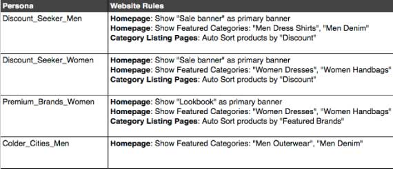
- Come up with 4 or 5 distinct personas that represent your target customers. (See example below)
- Once you have the personas defined, tag every campaign and Ad Set with the appropriate persona. For example, if you use UTM tracking for your marketing campaigns, you can pass an extra variable in your URL such as “utm_persona” which provides a better context about the visitor.
- Then in Google Tag Manager, you can setup rules that dynamically update certain predefined content zones on your website based upon the visitor persona.
- You can even use JavaScript in Google Tag Manager rules to automatically set a different sorting order for your products (based upon the User persona).
- Within the same rules, you can also fire a special Google Analytics event so that you can track the conversion rate improvement associated with these dynamic rules.
Sample personas for an online fashion retailer.
Think about your website as a smart salesperson who is able to understand the context of your customer, and speak the language that resonates the most with the customer. There is a lot of information that can be inferred about the visitor by using the referring campaign’s targeting criteria. Take advantage of this information and personalize your website and landing page content to better manage the visitor’s journey on your website.
Tactic 2: Make Your Campaign Hierarchy as Granular as Possible
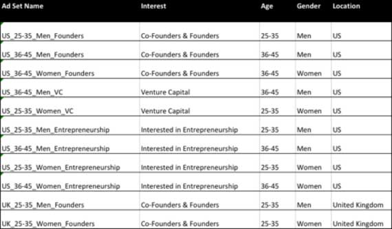
Many websites run large monolithic campaigns that target multiple demographics and interests. If you are running Facebook ads, create as granular ad sets as possible so that you can easily spot the best segments that are resulting in greatest performance. For example, my current startup targets early stage entrepreneurs who might be looking for branding help. In this case, breaking the ad sets in the following way allows us to get much better insights about which segment is delivering the best performance:
Yes, managing your ad sets at a much more granular level can lead to additional overhead but it can definitely pay off in the long run. You will be able to find hidden gems much more easily and avoid wasted spend on the segments that are not delivering a strong ROI.
When you are optimizing the ad sets, change one thing at a time and measure results. For example, do not change the ad copy, targeting criteria and bid price at the same time. You will never know what led to the improvement (or deterioration) of your campaign performance.
Keep a log of the changes you are making for optimization so you can refer to them. Once you have documented your changes for 30-45 days, you will start seeing interesting trends such as: ads which include a specific time limit (“only 5 hours left”) result in much better CTR than those with generic messaging (“Sale Ending Soon”).
Did you know? With Kissmetrics, you can track the effectiveness of your online advertising. Optimize your marketing by knowing which campaigns perform and which don’t. Check out our infographic to learn more.
Tactic 3: Smartly Segment Your Retargeting Audiences
Retargeting is a great strategy to convert some of your recent visitors to buyers. A little bit of segmentation can go a long way in optimizing your retargeting campaigns.
First, it is generally safe to exclude all those visitors from your retargeting campaigns who bounced after seeing your initial landing page. It usually means they were not interested in your product or service. Don’t feel bad. It happens. Maybe they landed on your website accidentally, or they realized that your offering is not a good fit for them. Whatever the reason, I have seen a significant ROI increase by excluding those people who bounced after seeing the initial landing page, or those visitors who spent less than 60 seconds during their visit.
Second, always focus on the lowest end of your funnel as the starting point. This is your bullseye. Customers who left your website from the final payment or conversion step might just need a little bit of push to purchase. Those who left from a page that is higher up in your purchase funnel might need a bit more convincing. Create separate segmented lists that correlate to different steps in your purchase funnel. Your bidding strategy should correlate to audience belonging to these steps. Always bid highest for those visitors who abandoned from the final step of your funnel.
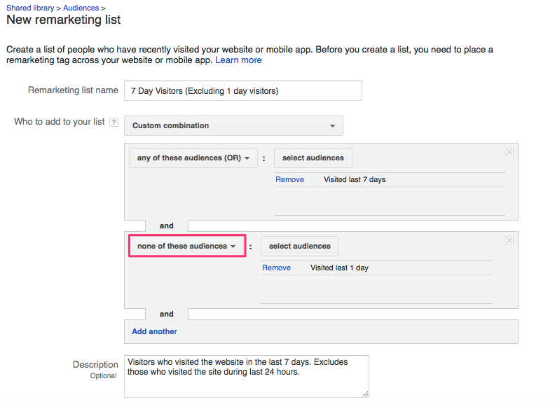
Don’t forget about time-based segmentation. Generally, you will see a much better outcome from your recent visitors compared to those that visited your site, say, 7 days or 30 days ago. When you are setting up time-based lists, pay close attention to setting correct exclusion rules. For example, in your 3-day list, always exclude those who belong to 24 hour list. This way, you can ensure that there is no audience overlap in your 24-hours and 3-day lists.
In Google AdWords, you can setup these exclusion rules by using Custom Combination lists.
One more thing – please set some frequency caps to make sure you are not following your audience till eternity. Showing your ads too often can actually turn off your potential customers. I would recommend setting a frequency cap of no more than 5 impressions in a day. However you can test different caps to see what works best in your situation.
Tactic 4: Consider LifeTime Value (LTV) While Optimizing Campaigns
If your website focuses on multiple product categories, you might find that the lower priced or discounted products deliver the best conversion rate. You might be tempted to spend more on those campaigns that are delivering the best cost per conversion. However, this is not always a good thing.
If you analyze your revenue and profitability from these campaigns, you might find that the most profitable campaigns are those where the customers are purchasing higher value products, and where the customers have a greater probability of making a repeat purchase.
To illustrate this, consider the example in the table below. At first glance, the campaign with conversion rate of 3% and cost per conversion of $20 seems to be the most effective and you might be tempted to allocate more marketing spend towards this campaign.
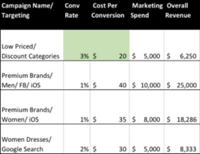
However, once you bring in the revenue, order value and LTV data, the picture changes completely. With the additional data, you will notice that the campaign that targets men on iOS devices seems to be delivering the best overall margin as well as LTV.
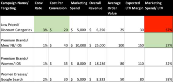
Assuming your goal is to improve your bottom line, your marketing spend allocation should be based upon an overall ROI metric which takes into account the LTV of customers acquired from that campaign. Consider building your own custom dashboard (or use an analytics tool like Kissmetrics) to monitor marketing effectiveness, taking into account your internal profitability metrics such as margin and LTV.
Tactic 5: Make Use of Automation
There is a great deal of automation available in platforms such as AdWords that can help you optimize your campaigns on an ongoing basis. Don’t get me wrong – I am not suggesting you put your campaigns on “cruise control” and expect that the automation will handle your optimization for you. However, there are some fundamental levers that you can set up which would allow you to focus your time and resources on more strategic optimization.
Here are few examples of what you can automate in AdWords:
- Raise bids automatically to top of page bid if the keyword is delivering a strong ROI. Let’s say your target Cost Per Conversion goal is $25. In that situation, your goal should be to maximize the impressions for those keywords that are delivering conversions below your acceptable threshold. You can setup rules to automatically increase the bids to top of the page bid in order to maximize the impressions for these keywords.
- Automatically lower bids if your keywords are not giving a strong ROI. You need to allow enough time and impressions before you start reducing your bids. However, let’s say you expect your keywords to deliver a Cost Per Conversion of $30. You could set up rules to automatically reduce max bids by 20% If your keywords have already generated few hundred clicks, but are delivering a Cost Per Conversion of $40 or higher.
- Setting these rules will allow you to automatically optimize the “extreme” outliers so that you can focus your time and effort on other aspects of your campaign.
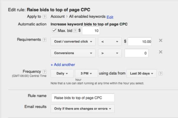
Automated Rules in Google Adwords
Conclusion
Marketing optimization is an ongoing journey. There is no finish line. Even though the above tactics worked well in our situation, you might find that they don’t work in your case. That’s ok. The key is to continue to experiment and test. As long as you take a focused and structured approach in experimenting your ideas, you will collect significant insights over time that work well for your business. As architect Buckminster Fuller rightly said:
“There is no such thing as a failed experiment, only experiments with unexpected outcomes.”
About the Author: Darpan Munjal brings over 19 years of ecommerce experience in technology and digital marketing with companies such as Sears, Kaplan as well as venture backed startups that he co-founded. Currently, he is the Founder of Squadhelp, a crowdsourcing platform helping startups engage branding experts for their naming and branding projects. You can connect with him on LinkedIn.
5 Online Marketing Tactics I Learned From My Previous Startup posted first on Kissmetrics Blog
from Blogger http://scottmcateerblog.blogspot.com/2017/02/5-online-marketing-tactics-i-learned.html
How to Recover From a Failed Product Launch
Launching a new product requires time, money, and a whole lot of elbow grease.
When the launch goes off without a hitch, all the effort seems worth it — but when it fails, it can send you and your business into a doubt-ridden daze.
Coca Cola’s ‘New Coke’ disaster back in 1985 still draws attention, while Amazon’s more recent failure with the ‘Fire Phone’ is still fresh in our memories.
The good news is even if your product launch was a total dud, there’s a strategic three-step recovery plan that can turn the tables in your favor once again.
Here’s how it’s done:
Step 1: The Autopsy
There’s usually a very real and quantifiable reason for the failure of your product launch — you just have to find it.
This three-step autopsy will frame your investigation:
Analyze The Data
First things first, you’ll want to analyze every piece of data surrounding the failure of your product launch.
Why? Because your product itself may not have been the reason for its failure — it may have been the customer journey surrounding it.
If you used Google Analytics, or any other entry-level analytics platform, you’ll want to begin investigating the following metrics:
- Bounce Rate: Your website’s bounce rate is the percentage of visitors who land on a page, and then exit before visiting any other page. By investigating the bounce rate on your website on a page-by-page basis, you can identify your weakest pages and then think about how to improve them in order to retain your traffic. To check your bounce rate using Google analytics, go to Audience > Overview.
- Exit Pages: Knowing where you lose your audience is key. If, for example, most of your traffic leaves your website at the checkout page, you can investigate your checkout process further to see what’s turning people away. You can evaluate which pages are leaking visitors by going to the Users Flow section in your Google Analytics dashboard.
- Entry Pages: It’s not all about evaluating bad news. By finding out which pages your audience is landing on most, you can work on optimizing that section of your site. You can access these metrics by heading to Site content > Landing Pages.
Additionally, if you are a Kissmetrics user, you can drill down to your website’s most relevant data with features such as:
- Path Reports: This Kissmetrics feature shows the quickest and most effective route your customers take towards your entire website’s goal.
- Objective-based Reporting: Don’t know what kind of report to create? Objective-based reporting is a Kissmetrics feature that recommends an appropriate report based on whatever your objectives are. For example, if you’re focused on improving your funnel, you can use the Funnel Report to see where prospective customers are dropping out before they purchase.
- Cohort Reports: This feature shows how segmented groups behave over time. You can use such information to figure out how well your audience in one particular country is reacting to a piece of content over time, for example.
The bottom line here is that you should try to get your hands on as much data as possible from your analytics platforms. You can then spend time analyzing that those insights in a way that will help you improve your conversion rates. This guide to ecommerce analytics should help you along the way.
Talk To Your Audience
Next up, you want to engage with your audience to find out what exactly turned them off your previously failed product.
Leveraging your email list is the most common way to reach out and survey your audience. It’s as simple as sending out a request for your subscribers to fill out a short survey on a platform such as SurveyMonkey. You could ask questions like:
- What did you dislike about ‘Name of Product’?
- How would you improve ‘Name of Product’?
- What ‘Name of Product’ features did you like?
- What were you trying to accomplish with ‘Name of Product’?
Or any other question that will help you better understand the perception around your failed product. As an incentive, you could offer them a discount on other products in your store.
You can also reach out to your audience on social media by running Twitter polls and asking for feedback via Facebook and Instagram.
To really make use of your customers, you can continue your outreach by inviting engaged members of your audience to meet you (or perhaps video chat with you), in order for them to further explain the problems they had with your product — and how they propose you fix it.
Reach Out to Experts
Although your existing audience will shed plenty of light on the failure of your product launch, hearing from experts from within your niche will enhance your understanding even further.
Websites like ExpertFile can help you find experienced names in your industry.
Once you whittle down a list of experts who can help you improve your product, you can reach out to them individually — and perhaps send them a free product — in order to get their take on why it failed to resonate with your audience.
Step 2: The Overhaul
Armed with the data from your autopsy, it’s time to revamp your marketing strategy in preparation for your new and improved product.
Apply All Necessary Changes
With the data you gleaned from your audience, and the feedback you received from the experts you reached out to, you need to apply all necessary changes to your product.
Naturally, the specific changes you need to make will depend upon the type of product you’re dealing with — but one rule always applies: don’t rush it.
Embrace the feedback you received, and take your time in applying it properly. The last thing you want to do is rush it back to market in a poorly prepared state.
Return to Your Audience
Remember when I told you to talk to your audience and set up feedback meetings? Now is the perfect time to reconnect and show them the changes you’ve implemented.
You can present new features (or features that have been stripped away), and demonstrate first hand that the product is in line with their feedback. If their updated opinions are now positive, you know you’re on the right track.
On the other hand, if they still have some qualms about the product, you can always go back and tweak it to perfection. Getting back in touch with those experts at this stage would also be a good idea.
At the same time, be wary of abandoning your own vision and intuition at this stage. The experts are worth listening to, but your own experiences with your audience will tell you things that no expert can.
Identify Your Target Market
Getting to grips with your target market is absolutely vital to the success of your future product launches. Thankfully, there are a few simple ways to do it.
First up, a quick visit to your Google Analytics dashboard can reveal the age, level of education, gender, and browsing location of your current audience. Alexa’s paid service expands upon all of that by giving you insights into things like the keywords being used by your competitors.
Analytics tools like Google Analytics or, even better, Kissmetrics can also teach you a thing or two about your existing audience. Google Analytics will give you an overview of what pages they visit and where in the world they are, but Kissmetrics is built to tell you far more about the people visiting your website. See where they’re coming from, where they drop off in your funnel, and remarket to your best customers – all within Kissmetrics.
Ahrefs is another handy tool that you can use to identify the audiences of your competitors — an extremely useful tactic for when your product rivals the offering of an existing brand.
Finally, you can use Hunter.io to get the emails of individuals within organizations that you could partner with, as well as influencers who can help get the word out about your future product launches. However, you should be cautious with unsolicited emails by not spamming the receiver’s inbox with multiple messages.
Define Your Keywords
Once your audience has been identified, you can start thinking about the keywords you want your content and marketing copy to revolve around.
The most efficient way to come up with keywords is as follows:
- Create a Seed List: Start with a seed list of terms based around your products. For example, if you’re selling furniture, start with keywords like ‘Oak dining tables’.
- Expand with Keyword Research Tools: Next, expand your terms by running your seed list through tried and tested keyword research tools like Google Trends and the Google Keyword Planner.
- Check Competitors: Finally, you want to check out which keywords your competitors are focusing on. This may sound difficult, but there are in fact tons of free and inexpensive competitor keyword research tools to help you achieve this.
Once you have your extended list of keywords, it’s wise to head back to Google’s Keyword Planner in order to see which keywords will fetch you the most impressions and traffic. That way, you can focus your marketing efforts around those select few keywords.
Select Your Marketing Channels
If you’re struggling to figure out which channels to market through, here’s a hint: Facebook, Twitter, Instagram, Snapchat, YouTube and Pinterest are the biggest players — and you should consider marketing through all of them.
With that being said, marketing veteran Neil Patel is an advocate of brands covering as much ground as possible when it comes to social media marketing. In fact, he advocates publishing on a wide range of social media platforms at least once per day. Be cautious of which social media platforms you choose (if any). Make sure it’s a platform that is used by your target market and has a good user base.
But if you’re still unsure of where to really focus your social media marketing efforts, here are breakdown of each of the top players:
- Facebook: With over 1.79 billion active users, Facebook is the world’s most popular social media platform in the world. Its most popular age demographic is 18-29, although it’s safe to approach it no matter who your target market is. Here’s a guide to Facebook marketing to get you started.
- Twitter: While not as big as Facebook, Twitter brings brands and personalities closer to their audiences by creating a very direct conversational link. This is evidenced by the fact that 83% of world leaders have a Twitter account. This Twitter marketing guide will teach you the basics.
- Pinterest: If you’re targeting women, Pinterest is for you. According to recent research, 71% of Pinterest users are female. Here’s how to start marketing on Pinterest.
- Snapchat: Originally touted as a passing fad, Snapchat is becoming a very serious player in the marketing scene, especially for brands targeting millennials. In fact, Snapchat’s biggest age demographic is the 18-24 age group. It can be a tricky platform to get familiar with though, so checking out this guide to Snapchat marketing is a good idea.
- Instagram: Like Snapchat and Pinterest, Instagram has a heavy focus on visuals. However, recent updates — such as Instagram Stories — have turned it into a very direct rival to Snapchat in particular. If that sounds like your cup of tea, you should check out this detailed Instagram marketing guide.
- YouTube: If you’re planning on creating long-form video content, YouTube is the place to publish it. Why? Because it reaches more 18-49 year-olds than any cable network in the U.S. Here’s how to start marketing on YouTube.
Step 3: The Lessons Learned
Now that you have thoroughly investigated the failures of your last launch, and addressed any holes in your marketing campaigns, it’s time to gather the lessons you learned for future reference.
The lessons, expert advice, and customer feedback that you gleaned from your failed launch should be compiled in the form of a marketing strategy document: which will be your smoking gun for all future product launches.
A marketing strategy document is an in-house guide that your sales and marketing teams can refer to when setting up marketing campaigns, and whenever a new product is getting prepared for launch. The lessons learned from the previous failure will prove invaluable in such times.
This marketing strategy template will help you to frame your content, although the following articles are also worth reading:
- The Ultimate Guide to Customer Acquisition
- The Inexpensive Marketing Plan
- The Ultimate Guide to Startup Marketing
You want the document to be the embodiment of your recovery process, ensuring that the same mistakes never get repeated in future.
To sum up, here’s how to finalize your recovery from a failed product launch:
- Gather all your analyzed data, expert opinions and customer feedback
- Put together an improved marketing strategy, with a redefined audience
- Create a marketing strategy template to house all your findings and new objectives
Once you have your final marketing strategy document, your team will be able to easily extract the lessons from your failed product launch — making it more like a successful experiment.
The Value of Failure
As serial-entrepreneur Richard Branson once said, “don’t be embarrassed by your failures, learn from them and start again.”
In light of that quote, it’s fair to say that not every move you make is going to be a win, so gleaning the positives from your worst moments is a vital skill.
Not only will this recovery process improve your product, it will also highlight your mistakes and give you a better understanding of your audience. Not a bad return for a complete failure, right?
Has your brand ever had to recover from a failed product launch? Let us know how you handled it in the comments section below!
About the Author: Anja Skrba is a content manager at First Site Guide, and she has been in the world of online business and content marketing for many years! You can follow her on Twitter or LinkedIn.
How to Recover From a Failed Product Launch posted first on Kissmetrics Blog
from Blogger http://scottmcateerblog.blogspot.com/2017/02/how-to-recover-from-failed-product.html
The Single Advertising Factor That’s More Important than Demographics (And How Measuring It Makes All the Difference)
When it comes to online advertising, no one is disputing that demographics are important. After all, they’re what powers your media buying and customer personas. The data you collect is meaningless without demographics to help you properly filter and segment it.
But dig a little deeper, and you’ll find something much more important than demographics powering actual conversions. And using it effectively could make a huge difference in your sales. Let’s take a closer look at what it is, and how you can leverage it to the fullest.
The Dismal State of Online Retail Conversion Rates
According to a report just released by Monetate in November, online retailers continue to struggle with e-commerce sales. A meager 3% conversion rate is something these retailers get excited about. But I’m of the opinion that this number could be much higher, and it has nothing to do with demographics.
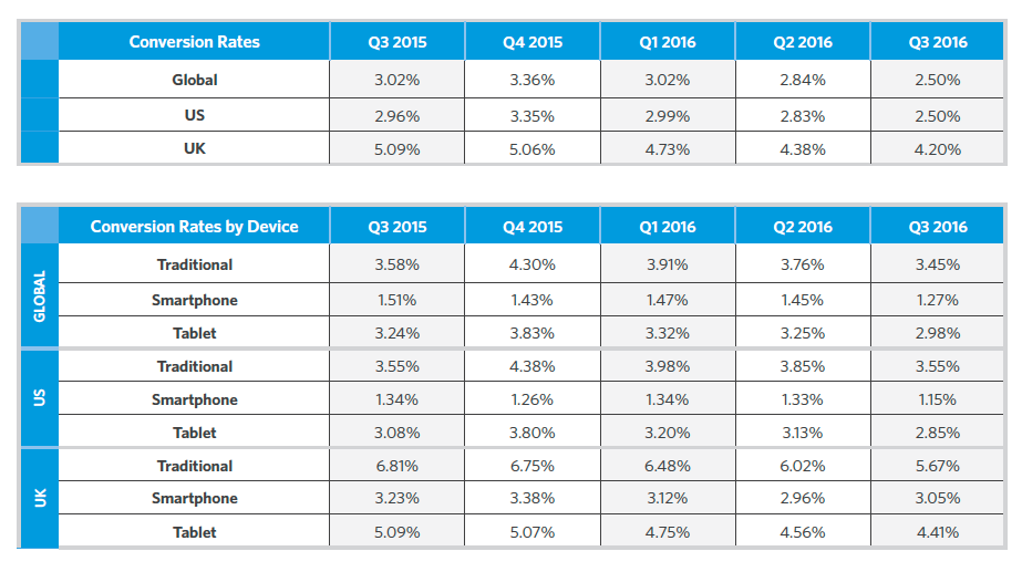
Fourth quarter e-commerce conversion rates across devices for the US, UK and global markets
Let’s use the just-passed holiday shopping season as a perfect example. Let’s say I’m in the market for a technology gadget of some kind. I’m already not in the target demographics for this market, which tends to lean heavily toward the 20-something male segment. I go to a website where I find the gadget, and proceed to buy it, but the shipping is a bit too high for my tastes, so I abandon my cart and go back to my search.
If you, as the online retailer, carried the same gadget at a better price or value, wouldn’t you want the opportunity to earn my business? Of course you would – which is why demographics go right to the back burner when it comes to enticing me to do business with you instead.
This is known as customer intent.
“So what?” I can hear you saying. “That was for a gift, and it was a one-off purchase, so it doesn’t count.”
But when you consider that 56% of mobile searches for sporting goods are made by women, and 68% of influencers for skincare and beauty were male, you can see how targeting by demographics alone goes right out the window.
How Do You Measure What You Can’t See?

You leave telltale traces of your intent every time you browse the web
Currently, there is no “one size fits all” tool to measure something like customer intent. It’s far too complex. We can, however, measure the things that lead up to intent. You do it right now without even realizing it. Cookie-based ads, remarketing, email automation — all of these things have been used successfully for years to help target ads relevant to the customer’s search.
But it’s not enough. Until now, marketers have relied on their existing automation systems, their CRM cata and other traditional sources (known as first party data) to better understand their customer base. More and more, however, a new type of data known as third-party data, is coming into play. Third party data is often captured through things like IP tracking, shared cookies or user opt-ins.
Let’s say a user comes to your site through a link on social media. They find an article funny or entertaining and decide to continue reading other, similar articles on other sites. Maybe they even leave a comment or two.
All of these actions leave a sort of “breadcrumb trail” for publishers to follow and glean insights from. Maybe the article you read had to do with funny images of babies, and perhaps your comment was a story about your own little one. From these few points alone, advertisers can deduce that you’re probably a mother of an infant or toddler, and that information, combined with other sites you visit, could paint quite a picture of you without ever being personally identifiable.
It’s questionable from a privacy perspective, but welcomed by marketers, as it gives them little tidbits of information about a prospect — just enough, perhaps, to measure their intent on buying.
So the question then becomes, how do we attract the kinds of people that are intent on buying?
Crafting Content for an Intent-Centric World
Just as all these first party and third party data snippets come together like pieces of a puzzle, so to must marketers and content creators do a little detective work to determine what kinds of content best resonate with that audience. One of the most well-known companies to leverage this kind of information in a meaningful way that boosts their own sales is the Home Depot.
A couple of years ago, they discovered that their do-it-yourself customers were browsing YouTube on their mobile phones to determine how to do different home improvement tasks, ranging from painting a room to building a fire pit. So Home Depot made several YouTube videos walking customers through the process of the most popular types of DIY projects:

Currently, the Home Depot’s YouTube channel has hundreds of how-to videos, all of which have received a remarkable 48 million views combined. There are lots of different ways you can leverage this strategy yourself, including:
- How to clean/repair/care for the products you sell
- Reviews of the products or their ingredients
- Recommended accessories or add-ons for the products
There are plenty of analytics tools available – including Kissmetrics – which can help you ascertain customer intent and then harness that intent to the fullest with helpful content, reviews and recommendations.
And although it may be a bit of a stretch to say that intent is more important than demographics, it nevertheless fills an important role that all marketers should be aware of when planning campaigns both now and in the future.
Which Do You Think is More Important? Demographics or Intent?
Do you weigh demographics more heavily than customer intent? Or is intent simply too cumbersome to measure? Do you think both deserve a place in your marketing plan? Share your thoughts with us in the comments below!
About the Author: Sherice Jacob helps business owners improve website design and increase conversions through content marketing and SEO copywriting. Get your free printable conversion checklist and web copy tune-up at iElectrify.com or follow @sherice on Twitter.
The Single Advertising Factor That’s More Important than Demographics (And How Measuring It Makes All the Difference) posted first on Kissmetrics Blog
from Blogger http://scottmcateerblog.blogspot.com/2017/02/the-single-advertising-factor-thats.html
Here’s How I Built And Launched A SaaS Company For Less Than $40k
About 6 months ago I decided that I was going to build a SaaS company from scratch. I had recently sold my company and found myself in discussions with a number of startups around making angel investments. This didn’t get me too excited so I wanted to see if I could build and launch a SaaS company for the same amount of money that I would have otherwise angel invested into other companies.
My thought process was that if I could pull it off then I would own 100% of the company, and have full control of my own destiny, rather than simply cutting a check and owning less than 1% of the company.
My background is primarily concentrated on small businesses, selling products like leads and back office software. In the past 6 years I’ve had thousands of conversations with small businesses discussing everything from how they operate to where they are spending money on marketing. Through these conversations I realized that a lot of businesses are leaving money on the table by not knowing where their phone calls are being generated from, not answering the phone all the time, and not knowing how to close a prospect once they are on the phone with them.
It was through these conversations and the success of the Twilio IPO that I decided I was going to build call tracking software.
Now that we have launched and have paying customers, I’m sharing the tactics I used to build and launch a SaaS company, along with the documentation that I created during this process including email outreach scripts, user stories, product requirements doc, and other tools I used to make it happen.
Step 1: Finding a Designer
In my opinion, design and user experience (UX) is one of the most important aspects of SaaS. Good design will go a long way to not only convert customers but help them engage with your product and ultimately retain.
To find a designer I used Dribbble, a community of designers that showcase their work. There are other similar sites out there like Carbonmade or Behance but I’ve used Dribbble in the past and felt more comfortable there.
You must be a paid member of the community to send a message to designers, which costs $20 for the year. After coughing up the twenty bucks (obviously worth it), I took about 6 hours one day and searched for designs that I loved.
I would search for things like “b2b dashboard”, “saas dashboard”, etc:

After browsing through hundreds of designers and portfolios, I narrowed down a list of my top 10. Since not all of them would be available to take on a new project, I decided I needed to contact them all in hopes that at least a couple of them would be able to work with me, at which point I would then select my favorite.
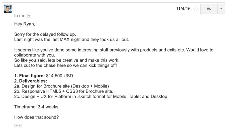
I sent them all this message:
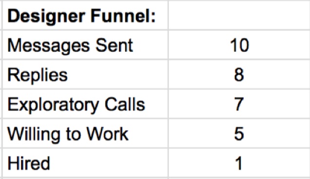
Of the 10 messages sent, I received 8 replies. One of the designers was not available for work (but replied anyway.. boom!) and 7 of them invited me to an exploratory call.
Here’s the funnel for my designer search:
The designer that I ended up choosing does amazing work, has relevant experience, and totally understood what I was doing. I personally wanted someone who I could lean on as a thought partner rather than them just blindly doing everything I told them. From the initial phone and Skype conversations, I could tell that the designer I chose was that person.
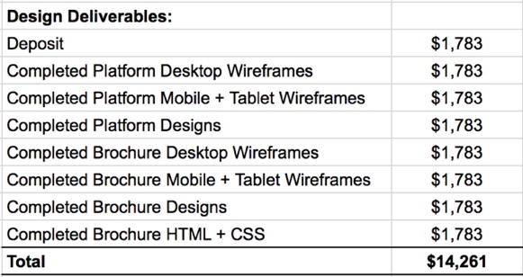
After thoroughly discussing requirements (more on that in a little), we landed on a fixed price for the project to be paid out at the completion of each deliverable.
Here is a cleaner view of the design deliverables:
I didn’t intend on spending this much money on design – however, it’s my assumption that good design and a beautiful user experience will pay off exponentially in the long run through higher customer lifetime value due to increased retention.
Step 2: Create Product Requirements
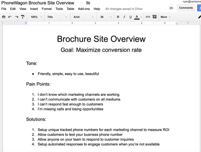
I don’t like the phrase “product requirements”. It sounds very corporate and heavy. When I refer to product requirements, I’m referring to all the various documents that help tell the story about what the product is, how it works, and who will be using it.
First, I created a very basic product design overview document (here) and product features document (here). These were created to provide both a high level overview of the product and very specific features that the product must have in order to provide value.
Next, I typed up a real life example of why the product is needed and the problem that it’s solving.
Finally, I created another document that went over the pain points that we are solving for and the solution that we’re offering to those pain points.
My designer recommended that we create user stories as well. As Mountain Goat Software explains, user stories are part of an agile approach that helps shift the focus from writing about requirements to talking about them. All agile user stories include a written sentence or two and, more importantly, a series of conversations about the desired functionality.
Ours ended up looking like this:
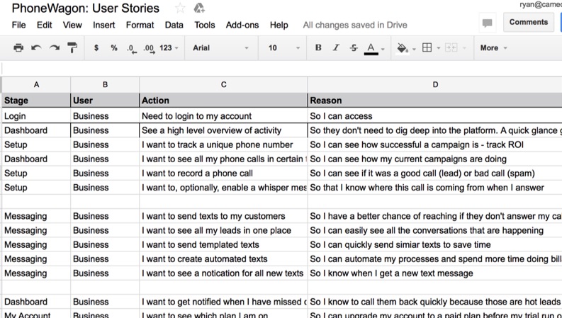
(see the document here)
We also filled out a worksheet based on the Hook model, the four step process companies use to build consumer habits. If you aren’t familiar, Hooked is an amazing book about how to build habit-forming products.
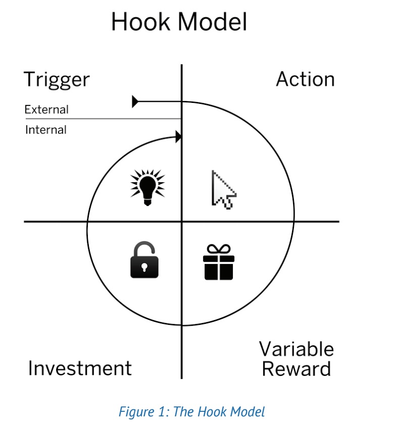
(Download the worksheet here)
Summary
During this phase we created the following documents to help us define our product requirements:
- Product Design Overview
- Product Features
- Real life use case story
- Pain Points & Solutions
- User Stories
- Hook Model worksheet
Now that we had thoroughly defined the product, it was time to move on to the agreed upon deliverables from the designer.
Step 3: Design Deliverables
My designer was very transparent and collaborative during the design phase. We would be in constant contact and talked on Skype throughout the day.
He would sometimes send me previews of wireframes and designs in Skype but would always throw them in a program like InVision afterwards to make sure everything is easily accessible.
The design process was very straightforward. We would spend a lot of time on wireframes because that’s where the customer experience and flow gets hashed out. This took quite a bit of time and a lot of back and forth thinking through various scenarios. After we nailed the wireframes, we moved on to design. My designer would send some designs along for feedback and I would comment on them until we landed on something we both agreed on.
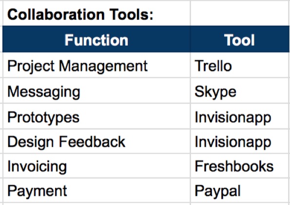
During the design phase we used a number of tools for various functions like providing a preview of the current designs (InVision) to submitting an invoice for the completion of each deliverable milestone (Freshbooks).
Here’s a quick list of the tools we used:
Step 4: Finding a Developer
The next step to building our SaaS product was, well, building it. Similar to how I searched for a designer on Dribbble, it was now time to search for a developer.
Before I began my search I needed to decide on a few things. First, I needed to decide if I was okay with using an offshore developer. Next, I needed to decide on the level of experience required. Finally, I needed to decide if I wanted a freelance developer or one that was working inside of a company.
While these aren’t exact, the ballpark hourly rates for different experience levels are below:
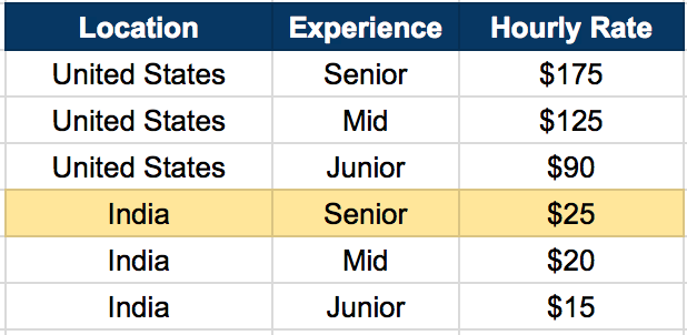
Due to cost I decided I wanted to hire a senior developer in India who was working inside of a company (not freelancing). That way I got access to project managers who would be holding them accountable.
To find the developer I was looking for I used Upwork, a website that connects clients with freelancers. I created a job post and detailed out what I was looking for.
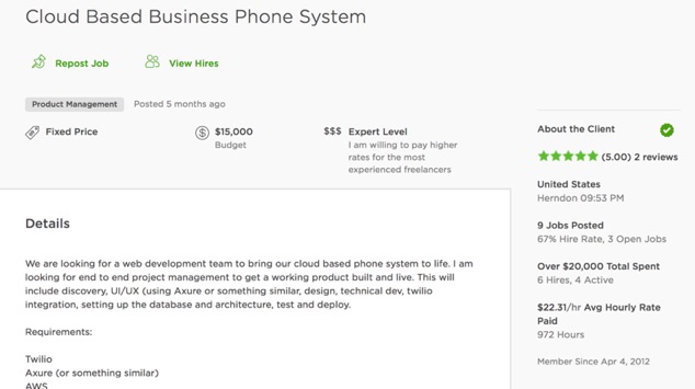
I received 39 applications to my job post and interviewed 6 people. To decide who I would interview, I looked very carefully at 3 things:
- Reviews
- Job Success Score
- Number of Verified Hours
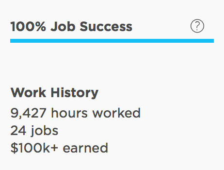
The developer I ended up going with had over 9,000 hours completed through Upwork and 100% job success score, meaning that 100% of his jobs resulted in a great client experience. These are numbers that the freelancers cannot manipulate so they are taken very seriously. In addition to our conversations, these things made me I feel comfortable hiring him.
Step 5: Building The Product
Building a software product from the ground up is challenging. There are a number of things to do that include setting up the project architecture, creating the database with schemas, tables, and triggers, setting up webhooks for API calls, creating login credential validation, and so much more.
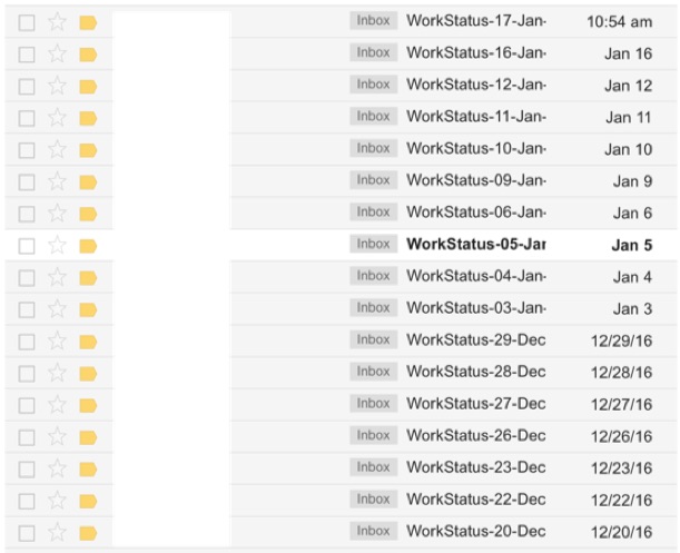
My developer gave me a rough estimate on the number of hours it would take to complete these various stages and updates me every 4 weeks on the status of our milestones.
![]()
He also sends me daily email updates so I know exactly what he’s working on each day.
We are also in constant communication at nearly all hours of the day. My developer is also a thought partner – he is coming up with scenarios that I’m not thinking of and providing very valuable product recommendations. This is incredibly valuable.
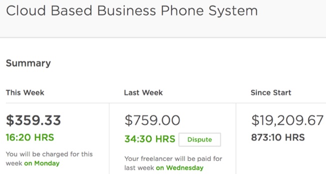
After about 6 months and over 850 hours, we were finally able to get a product shipped.
Here’s a snapshot of the developer’s hours as of the time of this posting:
Step 6: Marketing & Sales
Now that I had a working product, it was time to begin selling it. Now of course there’s a ton of content out there that goes over SaaS marketing and sales. I’m not going to dive into it too deep but rather give you an overview of what I did to begin selling my product.
To start, I registered a domain using GoDaddy, used WPEngine to host my site, setup branded emails with Google Apps, and then threw up a WordPress landing page.
To get my WordPress landing page designed and implemented, I posted a job on Upwork.
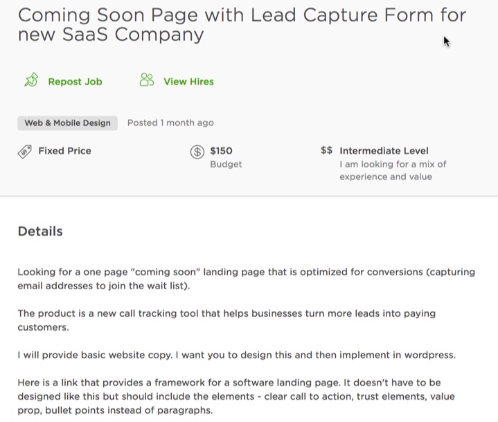
I paid $150 for this to be done and it took them about 2 days. The guy I used for this used the WordPress theme Divi, which is a powerful theme that makes it easy to build wordpress sites with their visual builder (so you don’t need to know how to code).
After the landing page was up, I ran some basic Facebook ads to drive traffic to the site. From there I would call every single person that submitted their information through my form.
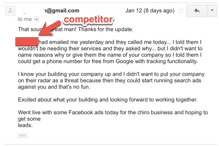
I created various phone scripts to document what was working and what wasn’t. I was able to get a couple paying customers using this method. I would create their account on the backend and charge them manually in Stripe. Then I would send them the URL of our software application along with their username and password.
My first customers loved that they were early adopters and able to contribute valuable feedback that would shape the product in the future.
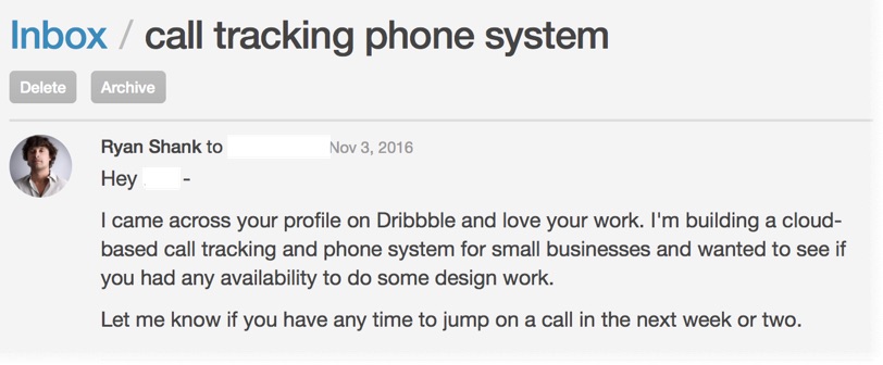
Here’s a cool email I got from one of my first few customers:
Conclusion
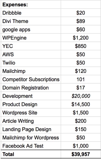
All in all, I spent just under $40k building my SaaS product:
I’m confident that if you use this approach you can also build a SaaS product for under $40k. This is a great alternative to raising a ton of money and diluting yourself and your future employees.
It isn’t going to be easy. It will require a lot of focus and effort. But if are able to follow this outline and find a talented developer and designer, you will be able to get your SaaS company off the ground. You don’t need a ton of cash or to raise venture capital to do this.
I hope this post inspires you to build and launch a SaaS company that people love.
About the Author: Ryan Shank is the founder of PhoneWagon, beautiful call tracking software that helps businesses improve their marketing spend by using unique local phone numbers on each of their campaigns. Previously, Ryan was the COO at mHelpDesk which was acquired by HomeAdvisor in 2014. Connect with him on LinkedIn or Twitter.
Here’s How I Built And Launched A SaaS Company For Less Than $40k posted first on Kissmetrics Blog
from Blogger http://scottmcateerblog.blogspot.com/2017/02/heres-how-i-built-and-launched-saas.html
Covert Conversion Hacking: A Behind-the-Scenes Look at How to Spy on Your Website Visitors
You’ve seen the stats before.
1-2% conversion rates for websites. Which means 98-99% ain’t buying. For one reason or another.
A bigger chunk of that is bouncing; leaving your site almost immediately after getting there.
You work so hard (and spend so much) on getting them there in the first place, and then they just… leave. It’s disheartening. Depressing.
The worst part is that you have no reason why. No specific clue or indication for what caused them to leave so abruptly.
It’s like someone walks into your retail store, takes one look at your goofy haircut today, and bolts for the door. You take it personal. The question eats away at you hours later.
WHAT is driving people away? Here’s how to find out.
The Problem with Surveys (Or, Why No One Answers Your Stupid ‘Likert’ Questions)
You could ask them, right? Hey, you could ask them!
Throw up a pop-up overlay, screen takeover, or slide something up in the bottom right-hand corner of the screen. Whatever it takes to grab their attention.
‘Cept for one problem: math.
You want a “statistically accurate” result, so you need a large enough sample size. For starters, let’s say you’re gonna shoot for around 100 respondents. (That’s on the low size, but it makes for simple math in a second. And I ain’t that smart, so gotta KISS.)
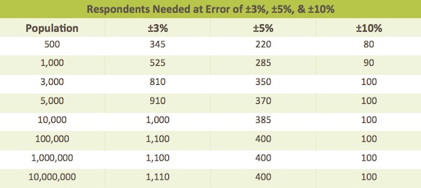
Great. How many people do we have to ask in order to get those 100?
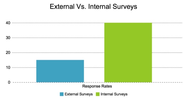
SurveyGizmo, whose advice seems decent given “survey” is in the name, says you can expect to see an average 10-15% response rate for ‘external’ surveys.
But…
That number can fall as low as 2% if your population is “less-targeted, when contact information is unreliable, or where there is less incentive or little motivation to respond.” In other words, exactly who we’re trying to reach with those flashy little tactics for untargeted website visitors.
So. IF we’re being incredibly optimistic, you need a population of 1,000 (at 10% response rates). But in reality, because it’s hard to incentivize and segment random site visitors, that number might be as high as 5,000. That number could go up still further, depending on how many terrible ‘likert’ and other terrible question formats are used.
Now. How many visits does your boring Services page get? How many for that new product?
It’s an uphill battle. Of Mt. Everest proportions. Just to get someone to give you any indication of what is preventing them from opting in or buying on this page.
Not to mention, the reliability of any information you do receive might be flawed based on lack of context and other common errors in surveys. We haven’t even touched on inherent survey bias. Which, there always is. (And which freaking Deming wrote about in ‘44!)
So. We can sit here and dream up ways to maybe, possibly, hopefully, get someone to answer a few basic questions and give you the ‘magic bullet’ for why they’re not convertin’.
Or. We can roll up our sleeves and find out for ourselves.
‘Specially, as it turns out, we ain’t got many other options. Here goes nothin’.
Three Easy Ways to Spy on Website Visitors
BounceX calls it “conversion friction”.
Which applies to all the things on your site that are preventing people from taking this microsteps, from looking at a particular page to adding a product to their cart or filling out a form.
The trick to spotting these friction points are to look for the clues left behind.
Some stats say 93% of our communication is nonverbal. Which means our behavior, or expressions, gestures, etc., give off more than we think.
Online, customer behavior can tell us what’s working or not working. Their actions give it away. If we only know how to listen.
Here’s three questions to ask in order to find out.
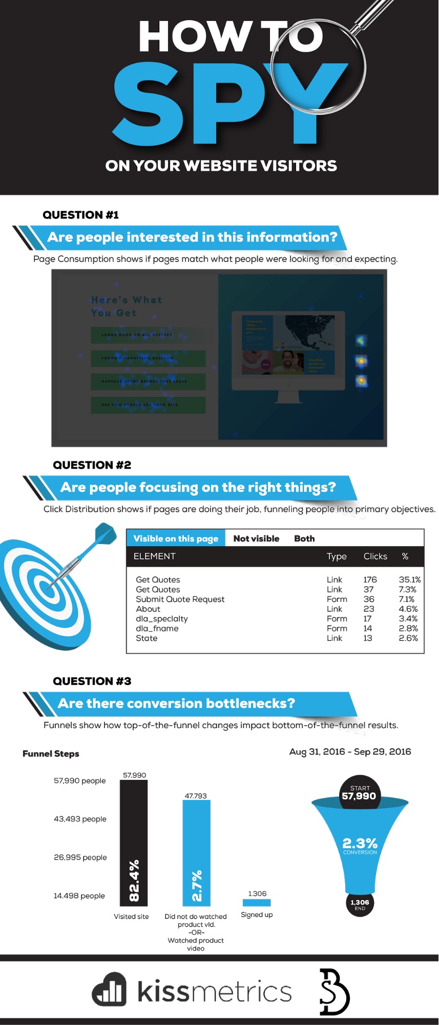
Question #1. Are people interested in this information?
Way before a purchase happens. Prior to a quote form getting filled out.
People land on a page and decide what to do next. To click, or not. The red pill, or the blue.
Design is the first thing they notice, 94% of the time, which helps them for a first impression with a few fractions of a second.
Much of that, is colored by their expectations. Their thoughts and motivations before ever arriving here. And the match (or lackthereof) of your page to those expectations can dictate whether they stick around (or not).
A person’s “state of awareness” can be deciphered based on how they got to your site. Namely, which channel or avenue they used.
For example, Google’s Customer Journey to Online Purchase tool will tell you how people use different channels, differently, along their own ‘customer journey’.
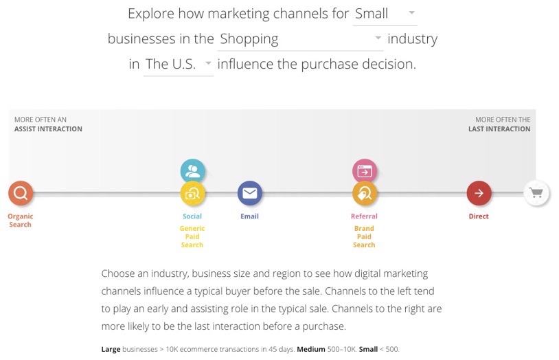
And this can help you answer age-old questions, like “long copy vs short”?
If it’s cold traffic from Generic Paid Search, long. If it’s warm traffic from a Brand Paid Search, short.
The thing to watch for, is page consumption.
Are people consuming the information on this page, or not? Are people reading and interacting with it, or not? Are they learning and discovering and finding what they need in order to make the next decision (that gets you closer to the money)? Or not?
Good old-fashioned heatmaps and scrollmaps can help you here, visually showing you whether you got it right (or not).
For example, feast your eyes on this:

This, is a long page. That rainbow-like color palette tells us it’s working though. People are actively reading and engaging along the way. Which ain’t too shabby, considering this is largely cold traffic from ads.
Case in point: let’s zoom into the ‘What You Get’ section two-thirds of the way down. Here, we’re trying to show, not explain, responsive design (without using complex, industry-jargon). So you want people clicking on the different options on the left, and then flipping between the corresponding device options on the right.

To summarize:
- People had their own expectations before coming to this page. (In this example, based on the ad they clicked on prior to coming here.)
- They’re expecting to see those expectations laid out properly.
- You design a page and present information to hopefully align those first two things.
- Heatmaps and scrollmaps can help you quickly, visually see if you got it right, or wrong.
- Page consumption is a good indication that people are going to click the next link, button, or CTA that gets them one step closer to conversion.
Question #2. Where are people focused?
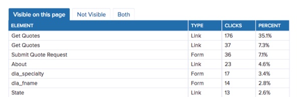
Trick question: What’s the primary action you want visitors to take on a Get Quotes page?
To Get Quotes!
Which means filling out a short form, and hitting a button or link of some sort that will send you their information, so that you’re able to, you know, send them quotes.
That’s it. That’s the whole goal of that page. Click distribution on a particular page can tell you if that’s happening.
So sticking with the same example, you should see the majority of page clicks on a ‘Get Quotes’ CTA for a Get Quotes page. Simple, right?
Let’s back up a second though.
What page, or CTAs across your site, are sending people to this Get Quotes page in the first place? Many times your final destination or purchase page is working fine. It just doesn’t have enough eyeballs or visitors on it yet. The ‘paths’ or funnels throughout your site aren’t clear.
For example, which of these two CTAs are you supposed to click first?

There’s no way to tell. They aren’t doing their job. Because they look and sound exactly the same.
You know what happens when a visitor isn’t led or directed properly?
This:
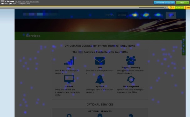
Chaos. Click distribution is all over the map. With the majority unfortunately congregating in the upper right-hand corner of the page on the primary menu, which is like the virtual equivalent to hitting your browser’s Back button ‘cause you didn’t find what you wanted.
Conversion-focused design centers everything around those one or two actions people need to take on a page. And in this example, just by simply changing a CTA’s shape or color, you could see a 64% conversion increase according to one MarketingExperiments study.
To summarize:
- Click distribution, or the percentage of people clicking different variables on your site, can help you quickly spot problems.
- The elements with the highest clicks should be your primary page objectives.
- Look at the page(s) that precede your ‘converting’-one to make sure they’re doing their job; priming people properly and sending a majority of its traffic.
- Change that page’s CTA’s to increase the number of people interacting with them.
Question #3. Are there conversion bottlenecks?
Every website contains a funnel. A path people progress through, exactly like a checkout process, to get from A -> B.
No matter if it’s B2C or B2B, people will go through various pages and steps to eventually transform from Stranger -> Lead -> Marketing Qualified Lead -> Sales Qualified Lead -> Customer or Client.
Often, the easiest way to increase conversions is to streamline or remove steps from this process. That way, you can get people to what they’re looking for faster, and easier.
We’ve already looked at a few ways to do that. You can spot which pages are ‘bottlenecks’ to the conversion process, by spotting that huge drop off of people from one step to the next and then cross-referencing what that page’s activity looks like to see what’s going on.
Keep thinking of it like one giant eCommerce Checkout process (even when it isn’t), where you’re sleuthing for clues behind the theoretical cart abandonment.
There’s only one problem to watch out for, however.
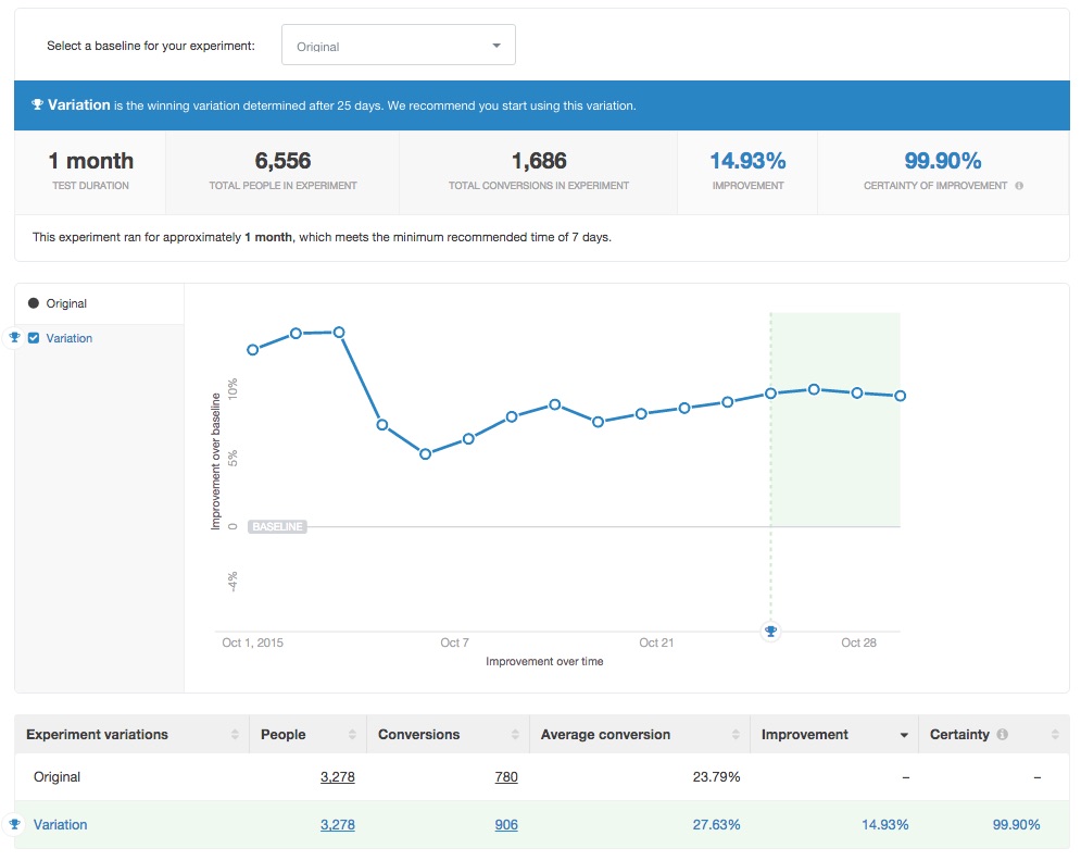
Up-and-to-the-right graphs aren’t always what they appear to be. GrowthHackers-newsfeed-busting-case studies featuring button A/B tests that delivered 10X traffic can turn out to be a red herring when little-to-no sales come in the door.
(Read our new A/B testing guide to discover the step-by-step process for getting results from your A/B tests.)
You don’t see everything you should be. Or you’re seeing bumps in one area, but not where it counts.
Skyrocketing free trials, when 70% of them turn out useless, are a pretty useless metric too.
The trick is to optimize the entire ‘user flow’ so that you’re optimizing revenue and not just conversion rates. That involves identifying and eliminating bottlenecks, or introducing new features at each step of the way to increase revenue gained.
Videos are one of my favorite examples because they’re one of the few things that almost always increases results.
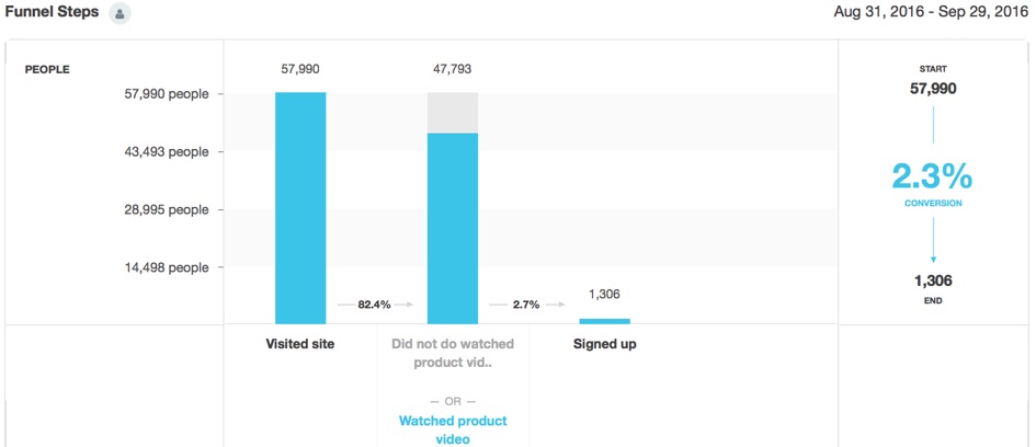
You can see this in action by creating a Funnel Report. For example, you can see how those middle-of-the-funnel steps eventually influence the right conversions you’re after all along.
Now, when you decide to run A/B tests, you can look at how those leading indicator changes not only affect initial signups, but more importantly the number of actual paying customers too.
To Summarize:
- Think of your website like an eCommerce Checkout funnel.
- Look for clues along each transition from one step to another to spot bottlenecks that are strangling your conversions.
- Remove or streamline the process from one step to the next to increase total conversions.
- Just be careful of ‘lying’ stats, that tell you one change is working to drive more sign ups (even though total conversions hasn’t changed).
- Look at how changes in the top or middle of your funnel affect the entire thing, including your ‘macro’-revenue generating objective at the very bottom.
Conclusion
Getting quality, qualitative feedback from website visitors is tough.
The numbers behind successful response rates are dim. Not to mention, all of the problems and errors and bias that most surveys contain.
Instead, let customer actions and behavior be your guide, showing you the spots on your website that are working and the ones that are strangling conversions.
Simple heat and scroll mapping tools will tell you if people are consuming the information on a page. Looking at total click distribution gives you an idea of if people are focusing on what they’re supposed to on each page. And full-funnel A/B tests will help you see how changes on inputs at one end affect results on the other.
Clues are left behind. You just need to know where to look.
About the Author: Brad Smith is a marketing writer, agency partner, and creator of Copy Weekly, a free weekly copywriting newsletter for marketers & founders.
Covert Conversion Hacking: A Behind-the-Scenes Look at How to Spy on Your Website Visitors posted first on Kissmetrics Blog
from Blogger http://scottmcateerblog.blogspot.com/2017/02/covert-conversion-hacking-behind-scenes.html
Monthly Income, Growth & Traffic Report – January 2017
https://www.google.com/jsapiThis is the 52nd income report as part of the zero backlink experiment.
Every month I will publish a post like this one that shows you how this blog is progressing and everything I have done across the month to get it there.
These reports will help me track my own progress while teaching you what to do and more importantly what not to do.
What I Have Done In January
January has been a great month for a number of reasons.
I managed to complete 2 larger projects that had taken significant time which has cleared the decks for me to catch up on smaller but essential tasks.
However everythings about to hit the fan as I’m going to return to the UK for 5 weeks next week to catch up with friends and family along with a visit to Thailand in the middle.
So with that said, lets take a closer look at what I did in January-
Why I’m Ditching Aweber
First and foremost, I spent most of the month planning my migration from Aweber to Drip.
Why?
Well because Drip is quite simply the new generation of email marketing, built from the ground up for the modern world of digital marketing.
This was not an easy decision as I’ve been using Aweber for nearly 10 years and they are still a great start point.
But my needs have outgrown them as I want to develop more sophisticated and personalized email marketing campaigns.
The migration process is going to be a huge head ache over the next week, but it is a necessary change that will have an immediate impact on the bottom line.
Here are just a few of the features that stand out for me-
Tags Not Lists
Aweber relies on having separate email lists of people, where as Drip just has one central list of people with tags.
So you can tag people that have signed up for the SEO lead magnet or tag them if they clicked a certain link in an email for example.

That means you can get hyper relevant with the emails you send out while making the whole thing easier to manage.
Now I know that Aweber have recently introduced tags with the new campaign builder, but it’s very much an after thought that they have fudged in.
Visual Workflow Builder
One of the most powerful features of Drip is the visual workflow builder.
That makes it easy to create powerful email marketing campaigns complete with if/then statements, goals, delays and much more-

Plus it looks beautiful right?
Automatic Resending Of Emails
When you send out an email, a large portion of your list won’t open it.
So to get around that, you can always re-send the email with a different subject line to people that didn’t open it the first time.
In Aweber this is an entirely manual process that takes 5-10 minutes to do and you have to remember to do it on the right day at the right time.
Where as in Drip, it’s just a check box-

That feature alone is worth it’s weight in gold!
Website Visitor Tracking
One of the coolest features I am looking forward to implement is the ability to track exactly which pages on the blog people have visited.
For example someone might read a product review on the blog which I could use as a trigger to send them an email with an exclusive discount code for the product.

Or I could track if people are reading tutorials about how to fix a Google penalty and automatically pitch them my penalty removal service.
There’s a million ways I can use this feature and I am going to be taking full advantage of it in due course.
Disabled Mobile Popups
Way back in August, Google announced they would start penalising sites that show intrusive interstitials on mobile devices.
Essentially what this means is if you show a welcome popup or exit popup that covers the content, you’re in trouble-

Luckily disabling popups is just a click of the button with Thrive Leads so it wasn’t a huge problem.
However I then spent time designing some new 2 step ribbon based calls to action to replace them-

That way I can have the best of both worlds, dodging the Google penalty while still collecting mobile email subscribers easily.
Luckily Thrive Leads have a bunch of templates ready to use so it was a very quick and easy process.
Content Audit Results
Last month I was working hard on a complete content audit to see which content needs updating, deleting or repurposing.
I also took a look at the performance of my regular income report roundups and what I have read this month posts.
Looking at the stats, both of these types of posts perform poorly when compared with other content.
So as of this month I will no longer be publishing income report rounds or what I have read this month posts.
I know that some of you will be unhappy about that, but that does mean I will have more time and resources to produce much better content all around.
In summary-
- 39 posts were deleted
- 23 posts need minor updates
- 40 posts need bigger updates
- 37 posts would benefit from post specific content upgrades
- There will no more income report roundups or what I have read posts
- Income reports are also on the chopping block for further review in the future
I am going to be working on all of that over the next few months to make sure you guys are getting the best experience possible end to end.
Running With The Bulls
This month also marked the annual Tope event where I live.
It is essentially a huge cowboy party where horses and cowboys take over the streets.
But the most exciting part is the bull ring, where spectators can get in with bulls and do their best not to get trampled on-
It’s pretty crazy to say the least and there are always a number of casualties! Luckily I wasn’t one of them!
Content Creation
First and foremost I spent a lot of time updating the deals section with new deals and discounts that you cannot find anywhere else.
There is now a total of 60 deals listed!
I also shared 23 SEO copywriting tips that got an awesome response from you guys!
After that I showed you how to choose the best VPN and how to use it for digital marketing/SEO activity’s.
Last but not least, I published an update to this post which shows you how to build a profitable business on Fiverr step by step.
Crunching The Numbers
So let’s get our hands dirty and see how the blog has actually performed this month.
Visitor Statistics
Last month traffic sat a steady 61,209 (1,974/day) which increased to 66,213 (2,135/day) this month.
That is means January was the 5th straight month that traffic stayed above my goal of 60,000 per month.

Most Popular Content
It was a close tie this month with with SEO copywriting guide, free SEO tools & Fiverr guides taking center stage.

Top Traffic Sources
The top traffic sources have remained pretty much the same as last month with nothing new to report really.

Search Engine Traffic
Search traffic has grown significantly this month after making a number of changes on site.
Last month saw 47,949 (1,547/day) visitors from Google which has exploded to 56,285 (1,815/day) this month!
I am going to be publishing a case study on exactly what I did to nearly double organic search traffic in the past 6 months shortly.

YouTube Views
I lost all of my historical YouTube views because of changes I made to the branding – so I keep track of them separately.
YouTube views increase gently from 18,388 to 18,638 this month.
That also had an impact on total minutes watched which also increased gently from 83,999 to 88,502 respectively.

Social Shares
This month the total social shares across Facebook and Google+ decreased from 73,606 to 73,263.
That is because I deleted 39 posts which also saw the social shares deleted alongside them.
Subscribers
The most important metric on the entire blog – earning a subscription from someone is the ultimate form of commitment and conversion.
This month brought 1,792 new subscribers which is steady drop from last months 2,146 new subscribers.
There are now a total of 156,455 subscribers across all of the various channels!
- E-mail – 1,257 (1,230 last month) / Total: 86,994
- Twitter – 233 (287 last month) / Total: 14,901
- YouTube – 179 (166 last month) / Total: 13,268
- Facebook – 93 (479 last month) / Total: 22,760
- Google+ – -24 (13 last month) / Total: 17,907
- RSS – 54 (-29 last month) / Total: 625
Unable to post graphs at the moment – will update asap
Income Report
Here are the numbers you really want to see-
Affiliate Earnings
- 48HoursLogo – $20.00
- A2Hosting – $85.00
- ActiveCampaign – $2.80
- Ahrefs – $298.39 (case study)
- Aweber – $101.70 (tutorial)
- Blog Advertising – $817.88 (Advertise)
- Blue Chip Backlinks – $150.00
- Bluehost – $65.00 (discount coupon)
- BrightSpark – $22.30
- BuyProxies – $65.40
- CashCrate – $11.17 (tutorial)
- CMS Commander – $19.21
- Domain Hunter Gatherer – $334.02 (tutorial)
- Drip – $00.60
- Drip Revolution – $288.05 (discount coupon)
- FCS Networker – $184.98 (discount coupon)
- FreshDrop – $18.12
- GetResponse – $40.77 (review)
- GSA Captcha Breaker – $622.44 (review / discount coupon)
- GSA Search Engine Ranker – $800.81 (review / discount coupon)
- GSA SEO Indexer – $47.51 (case study)
- HQ Biz In A Box – $16.20
- IPVanish – $489.21
- JustHost – $560.00 (start a blog / discount coupon)
- Kontent Machine – $177.45 (review)
- LeadPages – $489.90
- LearnDash – $45.15
- LinkAssistant – $41.17
- LongTailPro – $481.06 (review / discount coupon)
- MintVine – $6.70
- MyThemeShop – $125.30
- OneHourIndexing – $410.21 (case study)
- OptinLinks – $27.34
- PandaBot – $108.24 (case study)
- PowerupHosting – $43.97 (discount coupon)
- PrivateInternetAccess – $18.00
- PrizeRebel – $7.56 (tutorial)
- ProxyHub – $3.39 (discount coupon)
- Raven Tools – $49.97 (case study)
- RescueTime – $3.02
- SamCart – $99.00
- SEMRush – $903.72 (review)
- SENuke – $88.20 (tutorial)
- SEO Content Machine – $87.63 (discount coupon)
- SEO Monitor – $140.74
- SEO Powersuite – $98.67 (review)
- SEO Spyglass – $41.17
- SERocket – $322.50 (tutorial / discount coupon)
- SERP Book – $9.57
- SERPed – $1,201.50 (review)
- SiteGround – $50.00
- SociSynd – $16.85
- SwagBucks – $7.26 (tutorial)
- TBSolutions – $5.00
- TheBestSpinner – $131.00 (tutorial / discount coupon)
- ThirstyAffiliates – $25.08 (discount coupon)
- Thrive Themes – $33.50
- TrafficPlanetHosting – $430.00
- TrafficTravis – $30.49
- TweetAttacksPro – $14.85 (case study / discount coupon)
- Ultimate Demon – $220.42 (review / discount coupon)
- URLProfiler – $118.64 (discount coupon)
- VideoMakerFX – $173.00 (case study)
- WordAI – $129.34
Expenses
- Kinsta Hosting – $100.00
- Aweber – $119.45 (tutorial)
- Facebook Advertising – $148.36 (Case Study)
Consultation Earnings
I separate out the consultation earnings from the affiliate earnings. The blog drives affiliate sales directly and whilst it does generate consultation leads these are separate projects in their own right.
This month I didn’t taken on any consultation work so made a grand total of nothing!
Other Income
I’m working on another project right now that is part of the blog but not something I’m ready to talk about publicly yet or maybe ever.
I will declare the income here though as it wouldn’t be possible without the blog and ‘technically’ it is affiliate income.
Last month this was $10,840.73 which increased to $13,477.63 this month.
Earnings Total
- Affiliate Income – $11,478.12
- Consultation Income – $00.00
- Other Income – $13,477.63
- Expenses – $367.81
Grand Total: $24,587.94 / £19,485.94 ($22,759.89 / £18,518.28 last month)
Unable to post graphs at the moment – will update asap
Signing Off
It has been a great start to the new year, not just in terms of earnings but everything I have achieved this month.
With the content audit complete and the move to Drip, I have a clear road map ahead of me for the next few months on what I want to achieve.
The only spanner in the works is the fact that I am returning to the UK next week for 5 weeks, so I expect things to take a small nose dive.
On the flip side though I should have migrated everything from Aweber to Drip before I go along with some new email campaigns that will do the heavy lifting in my absence.
Thank you to everyone that has helped me reach my goals – I couldn’t do it without you, the reader!
Monthly Income, Growth & Traffic Report – January 2017 was originally published on Matthew Woodward
Monthly Income, Growth & Traffic Report – January 2017 posted first on Matthew Woodward Blog
from Blogger http://scottmcateerblog.blogspot.com/2017/02/monthly-income-growth-traffic-report.html
What to Do When Your Sales Conversions Start Shrinking
Sales decreasing?
Most companies experience a temporary slump during their existence. But don’t panic.
Take practical steps to move your company forward. When sales start declining, be mindful of what’s going right and what needs improvement.
As an ecommerce business, it may be time to upgrade your website. Research shows that “63% of marketers optimize websites based on intuition and best practices.”
Work with your team to enhance the customer experience. From changing calls-to-action to adding trust verifications, run experiments to correct your challenges.
Start earning more sales today. Keep reading to learn your next steps.
Find the Underlying Cause
When your conversions are heading downward, it’s easy for teams to immediately go into “let’s fix it mode.” However, the more effective response is to take a step back to find the underlying cause.
It’s very unlikely that the decline is related to a mysterious reason. For most businesses, it’s possible to figure out why your conversions took a permanent dip—one that lasts at least four months.
Gather your team for some company introspection. Review your customer behavioral data, churn reports, website analytics, and past sales conversations together.
Is the decline due to an internal factor? Maybe your business made product updates that customers didn’t like. Or the new marketing campaigns didn’t resonate with the target audience.
Did an external force cause the problem? Maybe consumer tastes shifted to another trend. Or market fluctuations occurred because of currency devaluations or the political climate.
After your team discovers the issue, that’s when the real work begins. You’ll want to create a company-wide strategy to tackle the decline from every department.
It’s not enough for the sales team to only execute tactics; everyone from product development to customer support must assist with the situation.
Perform daily and weekly check-ins to ensure all teams are moving in the right direction. And possess the flexibility to make quick adjustments.
Avoid the frustrations associated with a sales decline. Instead, stay calm, develop a plan, and take action.
Create Urgency to Buy Now
If your sales downturn is an internal issue, employ a new strategy. Focus on creating urgency for potential buyers who are hesitant about completing a purchase.
Urgency forces humans into a dilemma. Either we can take action at this very second or risk losing out on something we desire.
“Nothing increases activity like creating urgency around a purchase decision. Simply adding a countdown clock to your online shopping cart or telling people a sale ends today is enough to spike conversions,” says Forbes contributor Drew Hendricks.
Moreover, artificial time-constraints establish your product as a “need to have” versus a “nice to have.” That change of perspective makes your product more valuable to the consumer.
Hotels.com uses fear to tempt consumers to buy now. When guests are booking a hotel, the website displays a message telling the person how many other people are also interested in a particular hotel. With limited space, these popups encourage consumers to hit ‘Book Now’ sooner, rather than later.
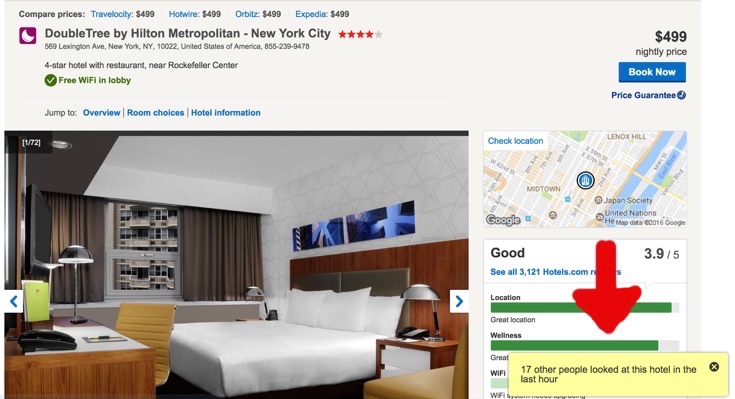
Show customers that you value their business. Give them a small incentive to purchase your products. Add a bonus ebook or access to a VIP event to the transaction.
Sometimes, consumers need an extra push. Give them a reason to purchase in the moment.
Remove All Distractions
Creative website designs are made every single day. From parallax scrolling to themed widgets, it’s appealing to want to add new features to your site.
But are all these features really necessary? You might be distracting visitors from buying. Instead of moving to the shopping cart, they get lost in cluttered site templates.
“If your visitors are distracted by too much content or are not taking notice right away, especially on mobile, then psychologically they will seek a more appealing design. This can include poor quality images or not enough visual content,” states Susan Gilbert, an online marketing strategist.
Design a straightforward path from your homepage to the checkout process. Display visible calls-to-action to ensure consumers know how to complete the purchase. And invest in live chat software to answer buyers’ questions as they shop.
By the end of 2015, mobile ecommerce transactions exceeded 40% globally. Smartphones lead in mobile purchases in the U.S., accounting for 60% of transactions. So, it’s important to update the mobile shopping experience.
Develop consumer-friendly forms that adapt to the buyer’s behavior. Form fields shouldn’t be obstructed from view by interface elements, like the keyboard. Mobile shoppers also enjoy other efficiencies, such as auto-populate, auto-capitalization, and credit card scanning. See the example below.
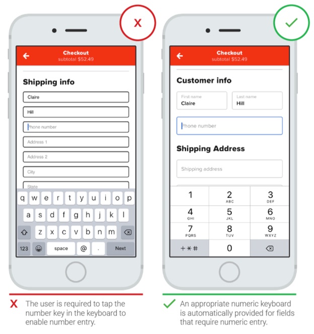
Distractions keep consumers away from your checkout carts. Get rid of them to earn more sales.
Gain Consumer Trust
Buyers crave an authentic connection with your brand. It gives them peace of mind that they are receiving a quality product.
Integrity is essential in business, and consumers need to know that you’re standing by your promise to deliver a high-caliber experience.
Garner consumer trust by creating an open dialogue with buyers. Share your business successes and failures. Then, give customers the chance to offer your team feedback.
Building credibility in your industry helps, too. Book your employees at major events to share their knowledge. Or host a small workshop within your local community. Your brand expertise might be a solution to a potential customer’s problem.
“Highlight the expertise in your organization and in the content and services you provide. Do you have experts on your team? Are your contributors or service providers authorities? Be sure to give their credentials,” writes Peep Laja, founder of ConversionXL.
The London School of Economics analyzed the revenue gains of increased positive word-of-mouth and reduced negative word-of-mouth. The researchers found that “reducing negative buzz pays off 300% over improving positive buzz.”
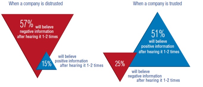
If your business is suffering from a negative perception, work with your public relations team to stop the cycle. You may need to seek assistance from an outside crisis management firm.
It takes time and consistency to build genuine relationships. Focus on both these qualities to attain long-term sales goals.
Retarget Your Consumers
Customers won’t buy your products after one brand interaction. You must persuade them to take a second look.
Retargeting serves as an opportunity to engage with visitors after they leave your site. Create specific ad campaigns to lure consumers browsing on other sites back to your shopping cart.
“By advertising across a display network, you can invest in ads that will attract the attention of those consumers, remind them of their past interest and, ideally, cause them to reconsider your brand and its offerings,” says Zuri Stanback, digital products director at Cox Media Group.
And retargeting offers significant results. The percentage of consumers who return and complete the checkout process increases by 26%.
Master your retargeting ads by adding a visual voice to your campaigns. Use images and video to capture the audience’s attention. In a site retargeting ad, Freshdesk uses a girl dressed in a superhero costume to represent how its software helps businesses rescue customers with support issues.

Also, practice the power of free. Drive online consumers back to your site with a free shipping offer or a free trial of your product.
Most sales won’t happen during the first customer conversation. Bring buyers back through retargeting.
Optimize for More Conversions
Your sales may be declining, but there’s always an opportunity to improve.
Examine the actual causes for the decline. Move customers down your funnel by creating urgency in your marketing messages. And remove any distractions affecting buyers from completing transactions.
Stop the shrinkage. Take action to secure more sales.
Did you know? With Kissmetrics, you can track the effectiveness of your online advertising. Optimize your marketing by knowing which campaigns perform and which don’t. Check out our infographic to learn more.
About the Author: Shayla Price lives at the intersection of digital marketing, technology and social responsibility. Connect with her on Twitter @shaylaprice.
What to Do When Your Sales Conversions Start Shrinking posted first on Kissmetrics Blog
from Blogger http://scottmcateerblog.blogspot.com/2017/02/what-to-do-when-your-sales-conversions.html
10 Disciplined Approaches to Google Analytics
We live in a world of digital data. We create it. We consume it. It’s everywhere. And it’s accumulating at an unprecedented pace. In fact, experts predict that we’ll be adding 50,000 gigabytes every single second by 2018.
That’s a whole lot of tweets, snaps, and posts.
But data goes beyond just social media, email, and YouTube videos. The successful businesses of tomorrow – and today for that matter – don’t just create and consume data. They use it to improve. For insight. To guide their decisions and goals.
Take Google Analytics, for example. It’s a fantastic product that provides a buffet of data about your website, your visitors, and your marketing. It’s the most widely used analytics solution on the internet (tens of millions and counting).
It’s so easy to collect data these days that everyone is doing it…from multinational corporations to the mom n’ pop store on the corner. But here’s the rub: having that data and using it efficiently are two very different things.
Analytics are only as good as your reaction to them. It’s what you do with that data deluge that separates the rock stars from the folks that plays bass in a garage band on Tuesday afternoon.
Setting up Google Analytics (with or without the enhanced ecommerce plugin) and then passively looking over the various overview reports while nodding and saying “Hmm, yes, I see” is worthless. Know that your bounce rate is 43%? Big whoop. What are you going to do about it?
You need to use it to get better, stronger, faster, and more able to deliver the experience your customers want. When you see X in the data, you need to respond with Y. You need to react to the data.
Or better yet, use the platform to answer your questions (i.e. be proactive rather than reactive). Orbit Media co-founder Andy Crestodina says Google Analytics is best used as a decision-support tool. He suggests a simple five-step process:
- Develop an idea or belief about your content and website
- Define a question that could define this belief
- Create a Google Analytics report to answer that question
- Take action based on the data
- Measure and manage the result
To help with both of those, here are ten suggested approaches to Google Analytics to get you started.
The Proactive Approach
Asking questions to either support or refute your ideas and beliefs is a surefire path to site success. Ask a question, then seek out the answer in the mountains of available data.
Approach #1 – What content/pages are resonating most with my audience?
All pages are not created equal, and despite your best efforts, sometimes your stuff will fall flat with your target. It’s in your best interest to know exactly which pages and what content is exceeding expectations, and which is lagging far behind.
Find out quickly under Behavior > Site Content > All Pages. Focus on those pages that visitors choose to view rather than those that they must view (like your homepage or search results page). Results are organized by most to fewest page views by default. Click on the comparison view to see individual pages compared against the site average for time on page, exit and bounce rate, entrances, and unique page views.
Click on “advanced” to filter your results and limit them to only blog posts, for example. When it comes to your data, specificity rules the day. Zero in on the metrics and pages that matter most to your questions, ideas, and concerns.
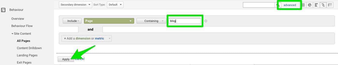
Once you identify the high performers, you’ve got insight into what your visitors want, enjoy, and like. Create more of that.
Once you identify the low performers, you can endeavor to improve or remove them. Excise the junk. Get rid of the filler. Beef up the stuff that you know can be of value. A high bounce rate – something in excess of 50% – typically indicates a lack of engagement.
So engage.
Approach #2 – Is any platform underperforming when compared to the others?
We live in a mobile world, but that doesn’t mean no one is using a desktop anymore (51.3% and 48.7% respectively as of November 2016). And while Chrome may be the browser du jour (56.43% market share), the segment using Internet Explorer (20.84%) or Firefox (12.22%) is still sizeable.
Use Google Analytics to determine if you’re meeting the needs of everyone equally.
Head over to Audience > Technology > Browser & OS to see what browsers and operating systems your visitors are using. Check out the bounce rate and conversion rate (CVR) for each one compared to the site average (it’s listed at the top of the column). If there’s one with a noticeably lower CVR or higher bounce rate, then it may indicate incompatibility or CSS rendering issues that need to be addressed.
If half of your visitors are using IE but your site doesn’t load properly in that browser, you’re going to see a lot of bouncing traffic and missed conversions.
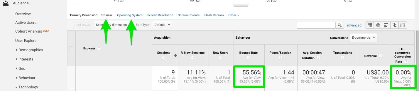
Ditto for devices. Look at Audience > Mobile > Overview. Check both bounce and CVR for desktop vs mobile vs tablet. Any anomalies? In 2017, if your site is not mobile-friendly, then you’re not friendly full-stop. People have no patience for a poor mobile experience. Problems? Fix them.
Use the comparison feature in either report to get a nifty side-by-side comparison for several key metrics like sessions, bounce, and conversions against the site average. Better? Worse?
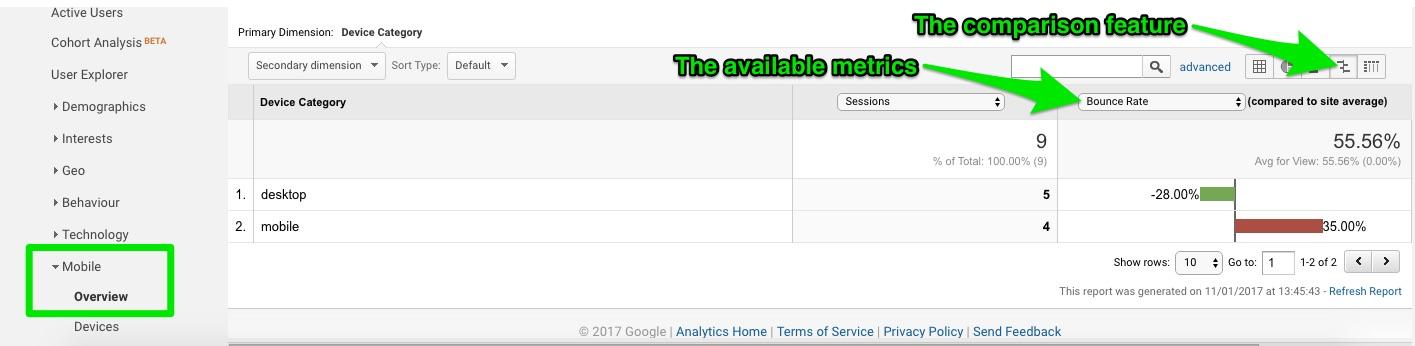
You want to create a powerful and engaging experience for all visitors, regardless of browser, operating system, or device. But let the data guide you. Prioritise your efforts based on your audience.
Approach #3 – What terms are bringing in traffic, and what do they search for once on site?
It’s all about the keywords, right? Even in 2017, you need to be aware of the words and phrases that bring in the crowds.
Search rules the roost. Search engines. Search fields on your website. Search, search, search. It’s how people find you and find whatever it is they’re looking for once they come into your virtual lair.
To find the terms people are using to end up on your site, you need to enable data sharing between your Google Analytics and Search Console accounts. Go to Admin > Property > Property Settings and scroll down to Search Console Settings. If you see your website URL listed, you’re already up and running. If not, add your website to Search Console.
Once the connection is in place, you can use Acquisition > Search Console > Queries to see what search queries resulted in your website appearing in the SERPs. What words and phrases are bringing you impressions and clicks? Those are the ones you should be using in your targeting, paid ads, and SEO efforts.
But those aren’t the only words that matter, of course. Consider what people are searching for after they arrive at your little corner of cyberspace. To do that, you need to enable search tracking under Admin > View > View Settings > Site Search Tracking. Turn it on.
![]()
To find and enter the query parameter, conduct a quick search on your site and look at the resulting URL. Your query parameter is usually (although not always) the word or letter immediately after the “?”. Enter it in the field, and hit “Save”.
Once the data starts rolling in, you’ll be able to see what words, items, products, and more that visitors are looking for on your site under Behavior > Site Search. The Overview report gives a wonderful snapshot: terms, categories, number of sessions with a search, number of exits after a search (people aren’t finding what they’re looking for!), and time spent on site after conducting a search.
Use the Pages report to identify those spots with unusually high searches. It could indicate insufficient information, poor navigation, or that it’s falling short in some other way. Shore it up.
Use the terms and categories to see what’s most popular, what products/services that people are looking for but you don’t yet offer, and the words and phrases you should be targeting in your copy and descriptions.
Approach #4 – Which landing page is delivering the goods?
Your various landing pages have a tough job. They’re the first impression. The entry point. They have to seal the deal and convert visitors to leads and/or customers. Do you know how well they’re doing that?
If you identify your top landing pages, you can optimize and improve them over time. Hypothesize. A/B test. Prioritize.
To find them, look no further than Behavior > Site Content > Landing Pages. Easy. Organized from highest to lowest sessions, you can instantly compare conversions, bounce rate, time on page, and so on against the average. Find your best – and worst – performing pages. Lean on the alphas, and tweak the runts with better headlines (try a few templates or analyzers for ideas), design, copy, visuals, and calls-to-action. Find any common mistakes being made, and work to improve them till they reach a respectable conversion rate (which is about 5-10%).
A poor performing page has no place on your website. Remove or revamp it.
Approach #5 – How are visitors engaging with individual pages?
Wouldn’t it be nice if you could see precisely how visitors were interacting with your individual pages?
You can.
A paid heat map like Crazy Egg can do it. But you can also get plenty of data from plain old Google Analytics.
You just need the Page Analytics browser extension.
With it, you can get insights galore about each page on your site, including bounce and exit rate, pageviews, time on page, number of visitors in real-time, and most importantly, in-page click analysis (a basic heat map showing what links users did and did not click).
Data like that is invaluable for improving the UX and increasing conversions. And that’s what it’s all about.
The Reactive Approach
Asking questions and seeking answers is good, but don’t ignore what the data is suggesting about things you haven’t even begun to examine or consider. Once set up, Google Analytics is going to deliver a steady stream of data to your digital doorstep. It’s your job to react to what it’s telling you.
Approach #6 – The Behavior Flow
Everyone loves a good flow chart. And the Behavior Flow report in Google Analytics provides a great visual of the path that visitors are taking through your website.
Why is that important? Because it provides answers to questions you may not have asked yet. Because it highlights the leaks, bottlenecks, and areas that need immediate attention. Because it identifies problem areas, popular areas, and pages to invest more design and improvement efforts, helping you eliminate weak spots and assess the effectiveness of any changes you’ve made to pages and content.
That’s why.
Located at Behavior > Behavior Flow, the report shows how visitors move from page to page (including their entry or referral point of origin), the different paths taken to the same ultimate end, where they leave you, and more.
Follow the paths:
- Unexpected pages? Misleading copy, confusion, visitors not sure what to do, how to do it or what they want. Simplify your navigation. Improve your copy. Strengthen the selling points and benefits.
- Frequent u-turns? Confusion in the navigation or unsure of their own intentions. Make it crystal clear and easy for them. Sell the benefits.
- Mass exodus? Something on the page is turning them off. They’re not getting what they need. Amp it up.
Look at their behavior from arrival to exit. Follow its lead. What is it telling you? How can you make their journey (i.e. the conversion) easier, faster, and safer? Do that.
Approach #7 – Event Tracking
It may be a little tricky to set up, but event tracking allows you to gather intel about behavior on your site that would otherwise remain off the radar because it doesn’t take visitors to a new page. Actions such as watching a video, giving a rating, clicking a button, leaving a comment, or downloading a file – in short, nearly everything people do while exploring your website – won’t appear in your data without it.
Use an event tracking code generator to make it that much easier, or you can get someone more comfortable with code to do it for you. Regardless, just get it done.
Once you do, your options are increased tenfold. Track which posts are garnering the most comments, how often visitors are leaving ratings and on which pages, how often people are submitting your contact form, which of your painstakingly created videos are receiving the most attention (including how many watch the whole thing, whether watching the video increases conversions, and more), and how many times your new infographic (or new whatever) is downloaded each week.
That kind of data can guide your marketing strategy, your business decisions, your content plan, and essentially everything else to do with your website and goals.
React to what it reveals:
- Popular video that nearly everyone watches to completion? Promote it. Share it.
- Blog post on Subject X got 3x as many comments as any other one? Write more about that.
- Newsletter sign-up on Page A getting twice as many subscriptions as Page B? Send all your traffic there. Use it as the landing page for a PPC ad.
Approach #8 – Channels
You already know this one, but it bears repeating: you need to pay attention to the channels that are bringing in traffic.
Online, it’s all about the numbers. Conversions ultimately matter more, but without sufficient traffic, there’s no one to convert in the first place.
Turn to Acquisition > All Traffic > Channels. You’ll see everything broken down by direct, organic search, social, email, affiliates, referral, display, and paid search.
Check bounce and conversion rates for each one. Is any one channel underperforming? Why do you think that is? Any overachieving? Perhaps lean on that more going forward, giving it a greater allocation of your time and budget.
Any channels missing that should be there? Double-check links and your other accounts.
Under referrals, click on each one to discover the exact page used to enter your site. Reach out to the sites linking to you. Build that relationship. Craft more of what they seem to like and share with their readers.
It’s so easy to just “check” channels and move on. But don’t. Dig deep. Interpret.
And yes, react.
Approach #9 – Exit Pages
Just as important as knowing where your visitors are coming from and entering to is to track and react to the exit pages on your site. From where are they leaving you?
Google Analytics has you covered there, too. Behavior > Site Content > Exit Pages.
Any unexpected ones? Any unusually high? Consider improving CTAs and/or using an exit intent pop-up with a great incentive to stick around.
Examine the content on your pages with higher than average exit rates. Is there something frightening people away? Up your trust indicators like social counts, testimonials, reviews, security seals, guarantees, and more.
Identify where they’re getting out, and politely close (and lock) the door.
Approach #10 – The Funnel Visualization
The funnel Visualization found at Conversions > Goals > Funnel Visualisation shows you quickly and conveniently how many visitors completed each page in your funnel, which pages are bleeding out (anything higher than a 40% dropoff needs to be improved with trust indicators, simplified processes, reduced distractions, greater persuasion, and so on), and how effective your funnel is as a whole.
It only works once you’ve properly set up goals under Admin > View > Goals and turned on the Funnel feature (and entered in the corresponding funnel pages). So do that. Right now.
Reacting – and reacting quickly – to the data collected here is crucial to your business success. If your funnel is leaking, or bottlenecking, or failing in any way, you need to fix it yesterday. This is one report you should be turning to on a regular basis.
Create a shortcut or add it to a custom dashboard. Make it dead-simple to remember and access the information. Track, measure, and manage.
That’s the beauty of Google Analytics: it can be something completely different to everyone. Build your own. Mix and match the four main categories of analytics data:
- Audience – who is your audience, and what are their interests?
- Acquisition – what channels, sources, and terms are bringing in the traffic?
- Behavior – what exactly is your audience doing on your site? How are they engaging, interacting, and using it?
- Conversions – are you meeting, exceeding, or falling short of the goals you’ve set for your business?
Those are the main ingredients. Start experimenting and crafting your own recipe.
What matters most to you might not matter at all to someone else. But with the powerful personalization options, the Google Analytics Solution Gallery for custom reports and more (check out these 12 awesome custom reports available for importing), and the ability to refine your workflow as you go, it can be exactly what you need it to be.
There’s a lot of data to sift through. Some is more important than others, so it’s up to you to determine the reports and metrics that matter to you and your business. And you could, of course, beef up your abilities with the Analyze (enhanced analytics functionality) and Engage (conversions made easier) products from Kissmetrics. It makes a good thing great.
Then, react to that data. Or seek it out with proactive questions that need answers. It doesn’t matter…so long as you do something. Aim for a generous mix of both and you’re golden.
How do you use Google Analytics? Are you more proactive or reactive in your approach to it? Leave your thoughts in the comments below.
About the Author: Aaron Agius, CEO of worldwide digital agency Louder Online is, according to Forbes, among the world’s leading digital marketers. Working with clients such as Salesforce, Coca-Cola, IBM, Intel, and scores of stellar brands, Aaron is a Growth Marketer – a fusion between search, content, social, and PR. Find him on Twitter, LinkedIn, or on the Louder Online blog.
10 Disciplined Approaches to Google Analytics posted first on Kissmetrics Blog
from Blogger http://scottmcateerblog.blogspot.com/2017/02/10-disciplined-approaches-to-google.html
